
This Game SUX


This Game SUX
When Pedagogy Meets UX Design
For our “Fundamentals of Human-Computer Interaction” course, Dr. Caro Williams-Pierce tasked us with taking a CHI Research Paper and redesigning how we interact with the paper. I chose the paper titled “This Game SUX: Why & How to Design Sh@*!y User Experiences” from CHI 2025. It was authored by Michelle V Cormier, Shano Liang, Bill Hamilton, Nicolas LaLone, Rose Bohrer and Phoebe O. Toups Dugas.
Year
2025
Industry
Human-Computer Interaction
Pedagogy
Scope
Content Planning
Interaction Design
Web Design
Frontend Development
Live Link

Problem Statement
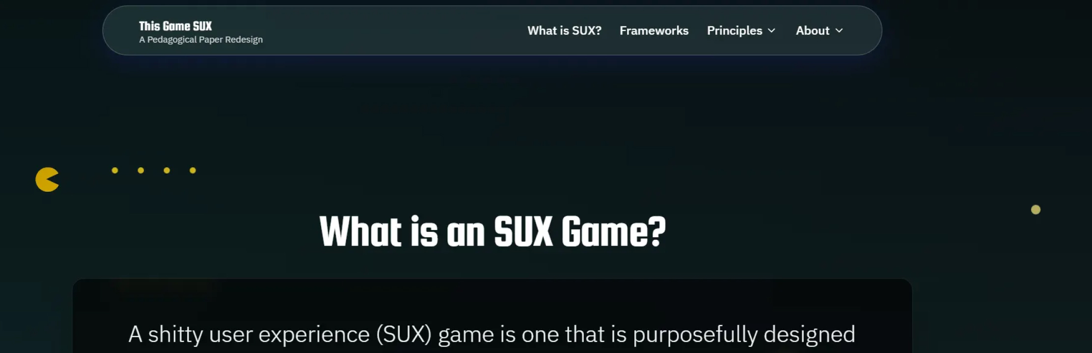
“This Game SUX” is an interesting CHI Research paper that explores why we should intentionally design frustrating experiences to make games more memorable and enjoyable. However, while reading it, I found myself struggling to stay focused. Walls of text and static images no longer sufficed to hold my attention. My challenge then became figuring out ways to make it even more interactive and engaging.

Tools
Microsoft Word (for Content Writing)
FigJam (for Sitemap Design)
Figma Make (for AI-assisted UI Design and Development)

Vision
Redesign the CHI Paper as an interactive experience which captivates user’s attention from start to finish

Values

Objectives
Reimagine the paper as an interactive experience
Simplify the contents of the paper to make it more accessible and palatable
Motivate users to stick through the entire experience

Target Audience
Academic Professionals and Researchers in Human Factors
Novice Game Designers

Success Metrics
Completion Rate
Ratio of Visitors who complete the experience vs total number of visitors
Citations
Number of increase in citations of the Research Paper after publishing this redesigned experience

Key Highlights
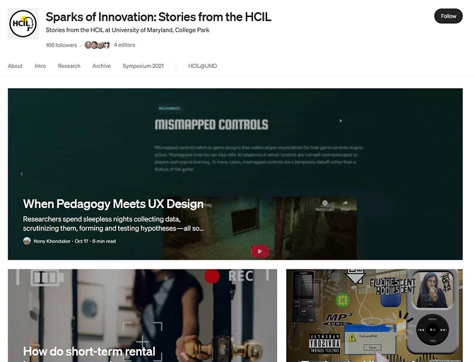
Featured in “HCIL: Sparks of Innovation” Medium publication

Design Process
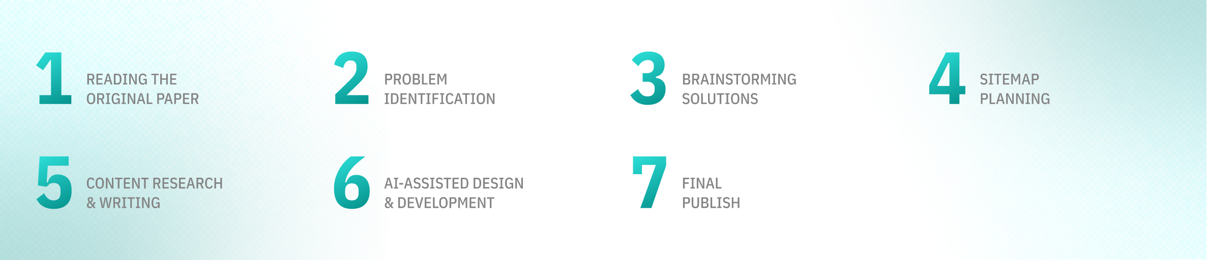

Discovery Phase
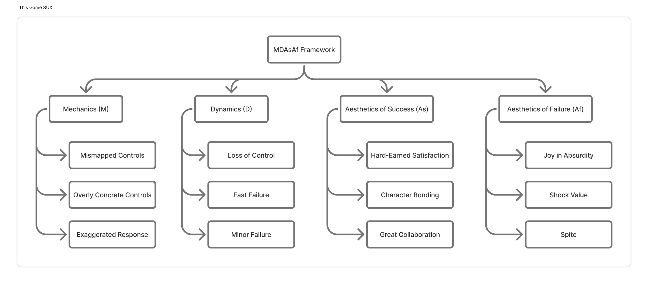
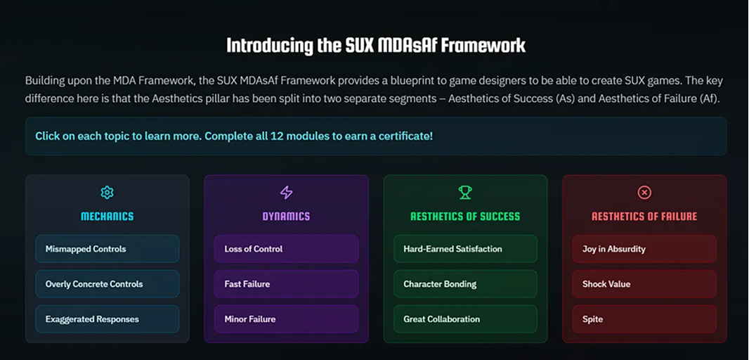
The original CHI paper introduces 12 game design principles which tie in with the well-established MDA framework. However, the introduction of a sub-tier of the Aesthetics pillar and designing the table in a vertical format made the concepts feel longer and more complicated than they really were.
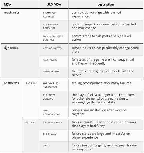
Snapshot from the Original Paper

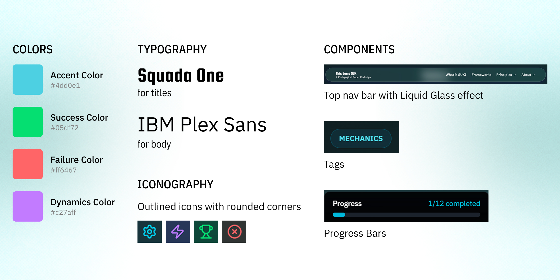
Design System

Information Architecture

Solutions
Content Simplification
In my redesign, I simplified the content by first- getting rid of the sub-tiers of Aesthetics and introducing an offspring of the MDA framework I like to call the MDAsAf Framework. Organizing the 12 principles side-by-side instead of vertically also helped make it seem less insurmountable.
Read, Watch, Play, Reflect!
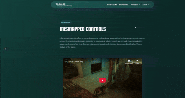
Long-running paragraphs and static screenshots from video games have been replaced by a brief description of each principle, a video demonstrating the principle and last, but definitely not the least, an interactive game within an iframe in the same page allowing you to witness the design principle in action.
Lastly, I allow the visitors reflect on these design principles in the form of a comments section/discussion board.
This content structure was inspired by the pedagogical technique implemented by Dr. Caro Williams-Pierce in her courses
Zeigarnik Effect as Motivator
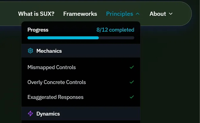
Zeigarnik Effect is a psychological phenomenon which persuades us to complete something when we see it in its partial, incomplete state. I thought it would be interesting to leverage this phenomenon to captivate visitors’ limited attention span and have them complete all 12 modules of the website by showing a progress bar of their completion status.
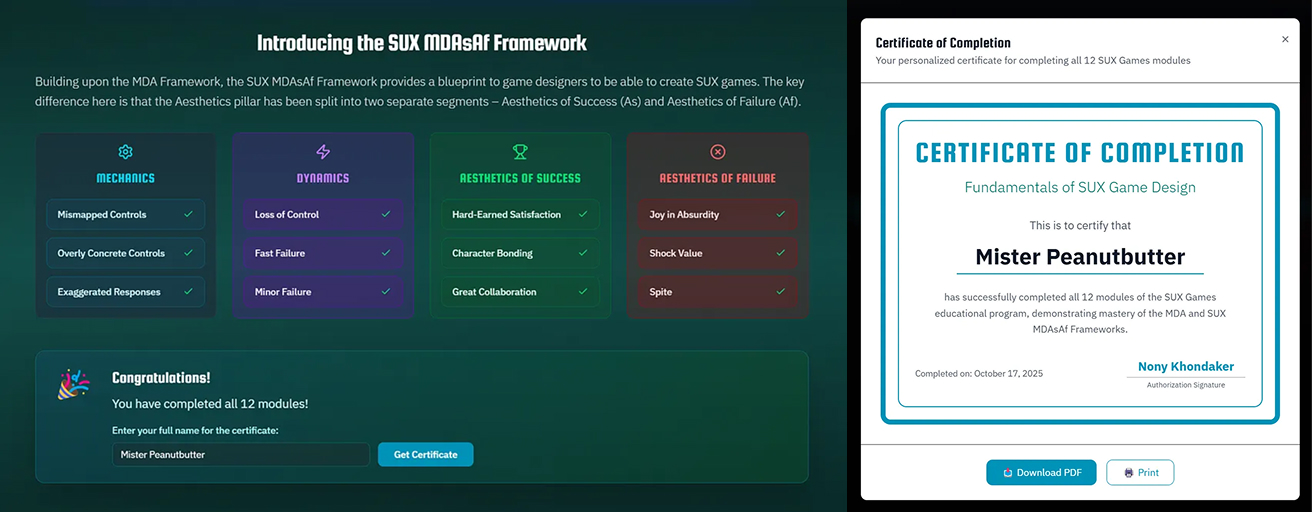
Certificate of Completion
For all their hard work, I also decided to reward the visitors by awarding them with a Certificate of Completion signed by yours truly!

Accessibility Considerations
Use of Vibrant Text Color against Dark Background for Contrast and Legibility
Use of Frosted instead of Clear Liquid Glass for Perceivability
Persistent Navigation Bar for Operability
User-friendly, layman terms over jargon for Understandability

Outcomes
The website was featured in the HCIL Medium Publication “Sparks of Innovation”. You can read the article here!
As there was no backend developed for the website, site analytics could not be tracked.

Retrospective
What I Learned
GenAI can only assist designers, not replace them
During the initial phase of the co-creation, when I was giving broad prompts, Figma Make was being unable to come up with satisfactory results. Only when I came up with the design solutions myself and gave very specific inputs about my vision, I was starting to get decent results from the AI
GenAI still struggles to understand humans
It often took me multiple attempts to make very simple fixes to Figma Make’s outputs because the AI was failing to understand my feedback. This led to a lot of waste of time (and Figma AI credits!). A human designer/developer would have been much faster in identifying and solving these issues
Technical Skills are no longer a barrier
As someone with no prior coding or web development knowledge, I was initially concerned how I would achieve the vision I wanted. However, Figma Make took upon all of the technical trouble onto itself and I only had to come up with design and product visions
Challenges/Trade-Offs
Figma’s Broken AI Credit Mechanic
Figma Make has an invisible AI Credit mechanic and when the credits run out, it locks you out of your projects. This often led to roadblocks in the creation process
Human-Computer Communication
The GenAI was repeatedly failing to understand or implement my feedback and often falsely claimed that it has “solved” the issue
Content Research
It was a painstaking process trying to find appropriate video and interactive examples of all the 12 game design principles
iFrame Restriction
Many of the interactive examples restricted usage of iframe. So, I had to incorporate links to the respective sites instead of embedding them directly on my site
What would I do differently now
Implement a backend for storing user progress and site analytics
Incorporate statistics in the Certificate Completion screen (e.g. “You are the 103rd person to earn this certificate")
Allow users to share the certificates on Social Media


4+ Years in PRODUCT DESIGN
HCIM STUDENT @ UMD