My Robi App

My Robi App
Redefining Telco Self-Care

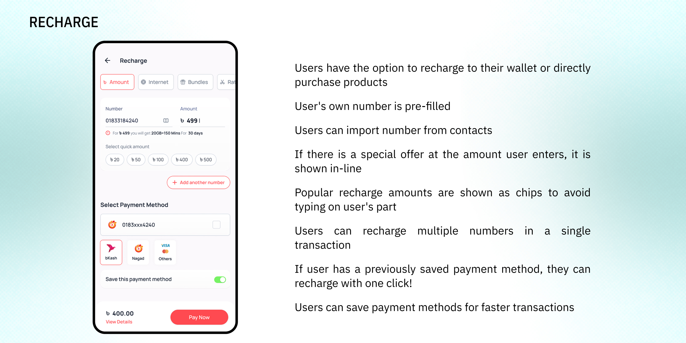
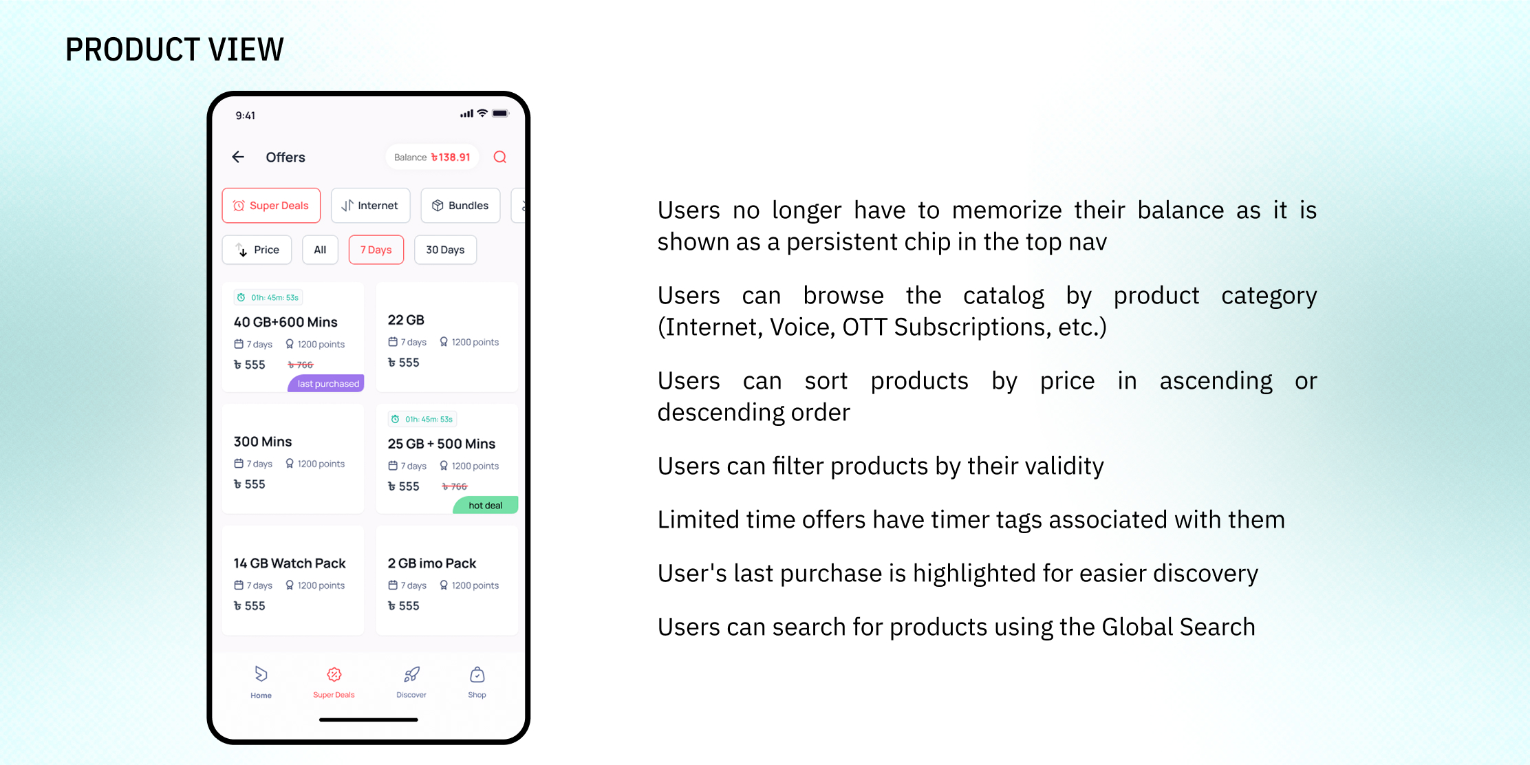
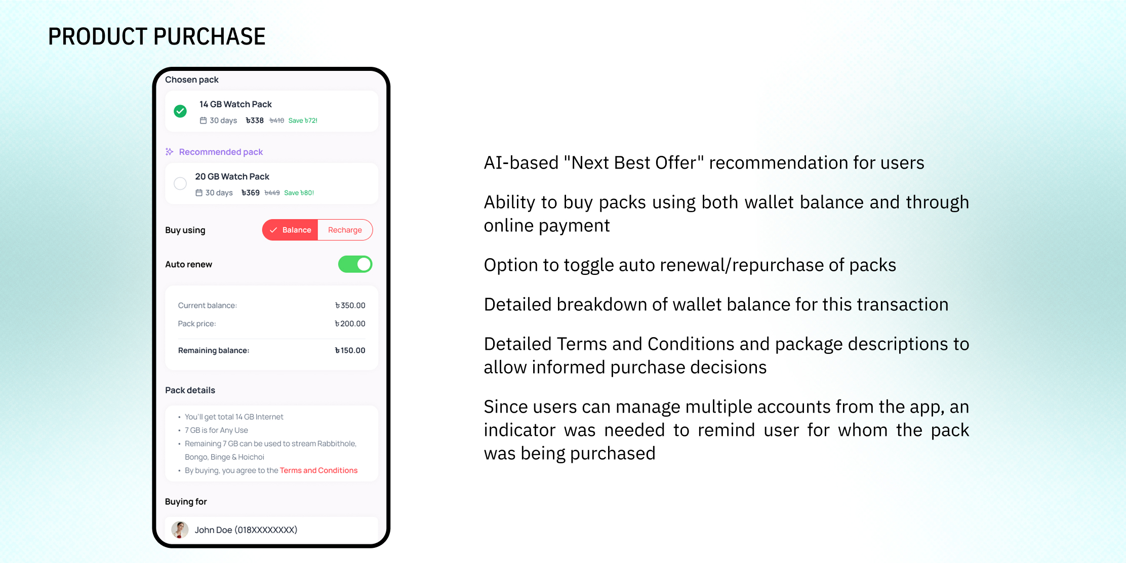
My Robi is the self-care app for subscribers of Robi Axiata, the 2nd largest telecommunications company in Bangladesh. The primary purpose of the app is to allow customers to check their balance, recharge their prepaid balance or pay their postpaid bills and buy internet and/or voice packages
Year
2024
Industry
Telecommunications
Scope
UX Research
Interaction Design
UI Design
Project Management
Individual Roles
UX Research
Wireframing
Prototyping
UI Design
Project Management
Management Updates
Annotations
Localization
Dev Handoff and Grooming
Collaborators
Saurav Biswas
Lamia Mehreen
Fakhrul Islam Rajib
Shah Md. Arafat Hossain

Problem Statement
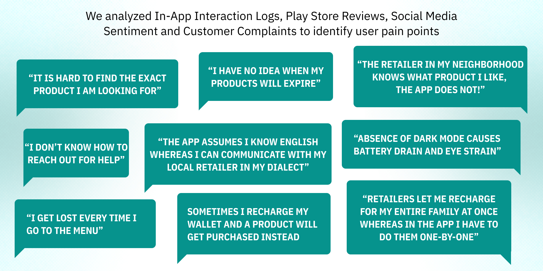
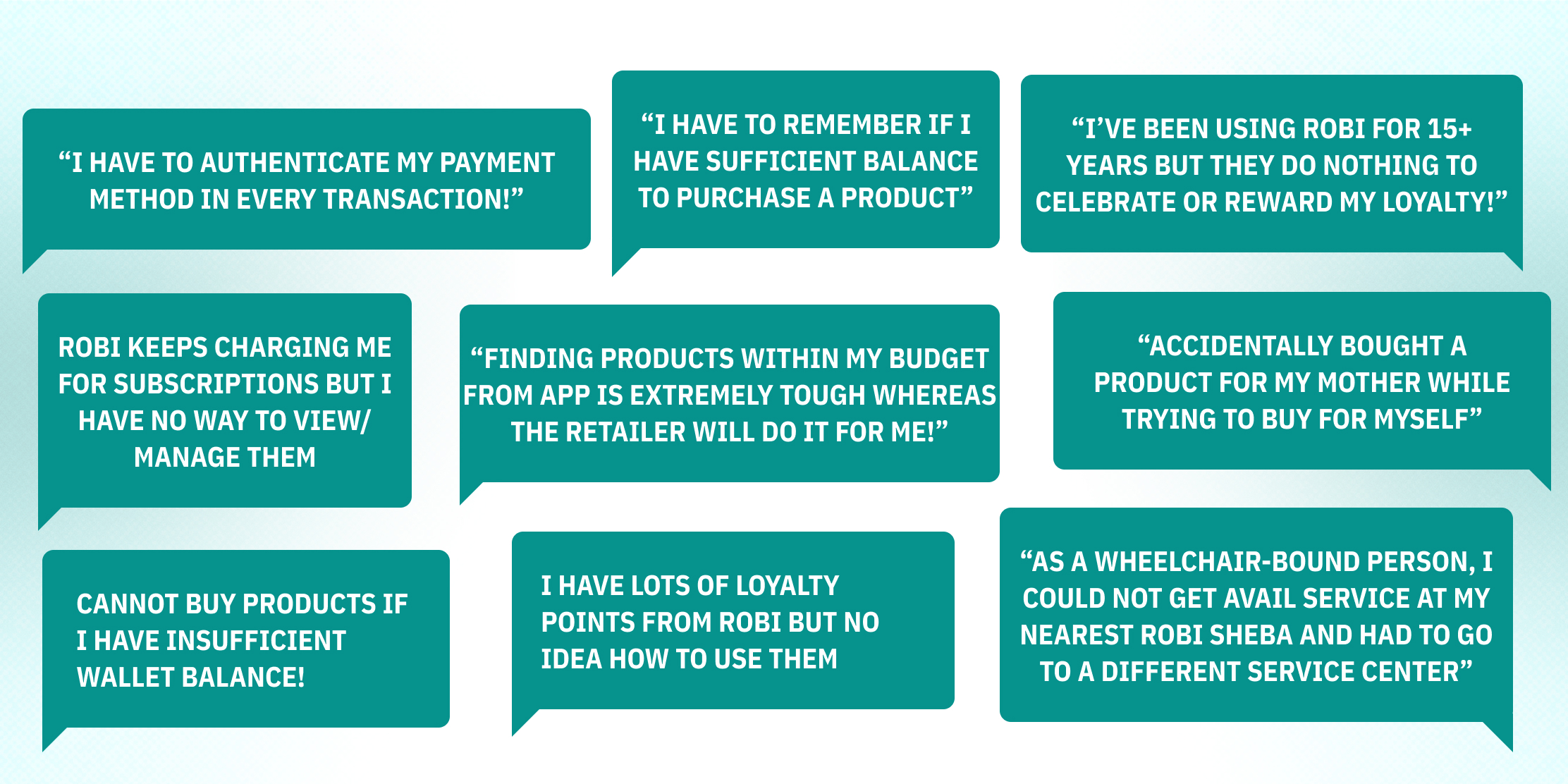
Despite existing since 2017, the My Robi app could never become the most popular channel for telco services amongst Robi subscribers. They still preferred going to physical retail shops or using third-party financial services such as bKash or Nagad - which meant commission expenses and revenue loss for the company. The challenge was to make services as simple and accessible as possible with a view to shifting consumer behavior.
Tools
Microsoft Excel (for data analysis)
Concepts (for wireframing on iPad)
FigJam (for brainstorming with team)
Figma (for Designing and Prototyping)
Trello (for Project Management)
Microsoft PowerPoint (for slide decks)

Vision
Providing best-in-class UX/UI to Robi subscribers for their everyday telco needs

Values

Objectives
Reduce friction in revenue-generating services
Increase user adoption and preference for the app channel
Match contemporary standards such as Material Design 3

Target Audience
25 mn+ Robi subscribers who own Smartphones and regularly use Mobile Internet

Success Metrics
Monthly Active Users
Google Play Store/App Store Ratings
% of Company Revenue Contribution
Y-o-Y Channel Revenue Growth
Reduction in Customer Complaints
Uptick in Average Revenue per User (ARPU)

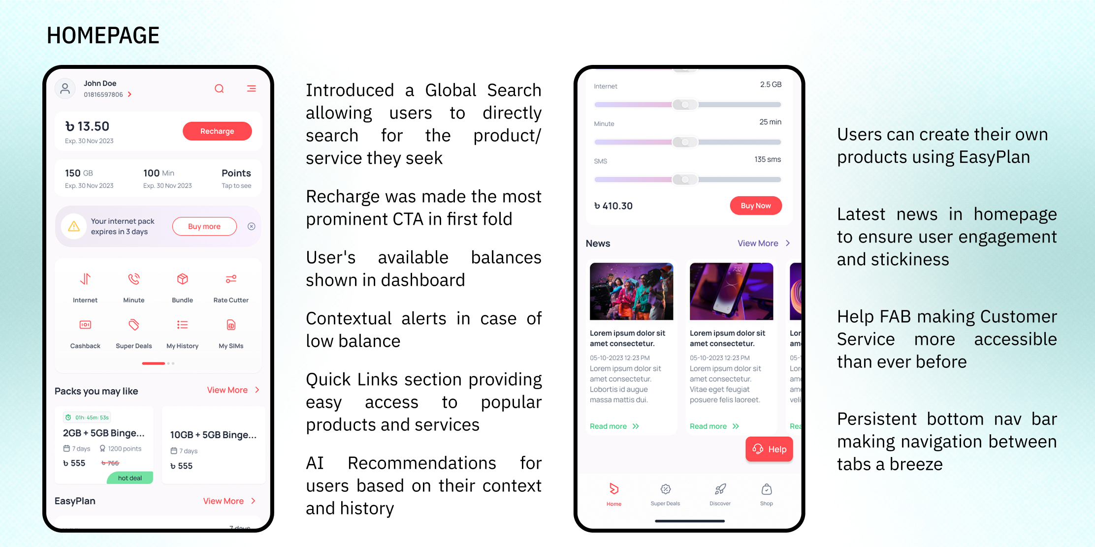
Key Highlights
20+ MN Monthly Active Users
Highest User Satisfaction in the Bangladeshi Telco Industry
38% Y-o-Y Revenue Growth

Design Process
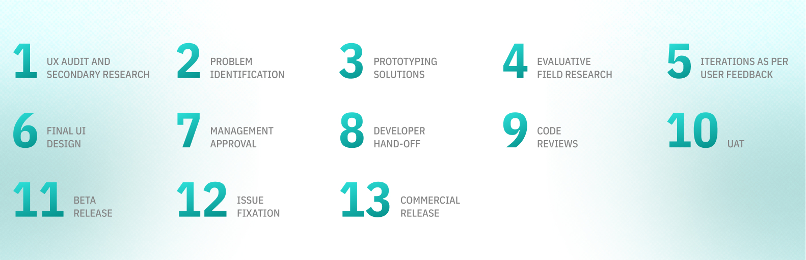

Discovery Phase

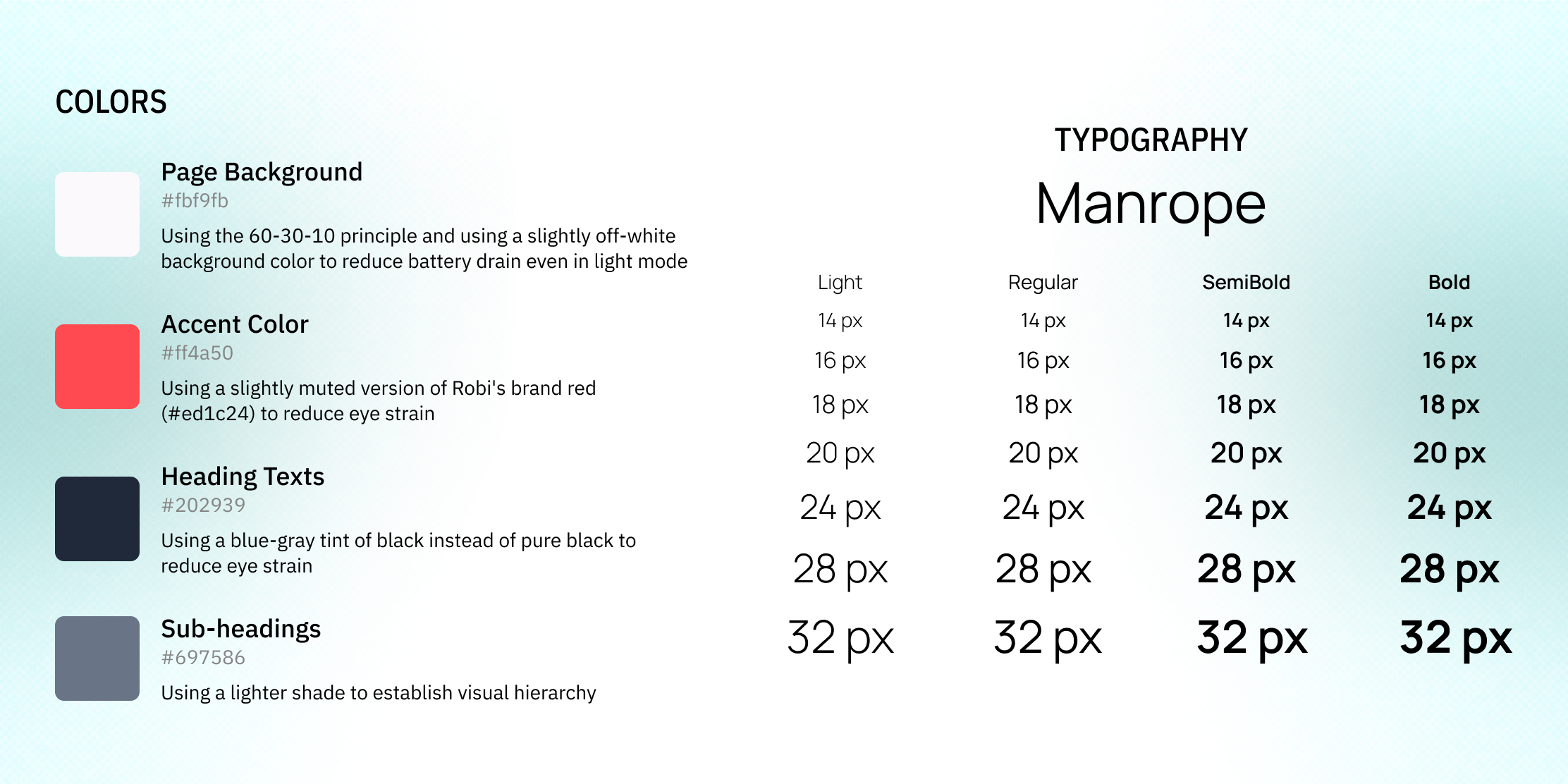
Design System
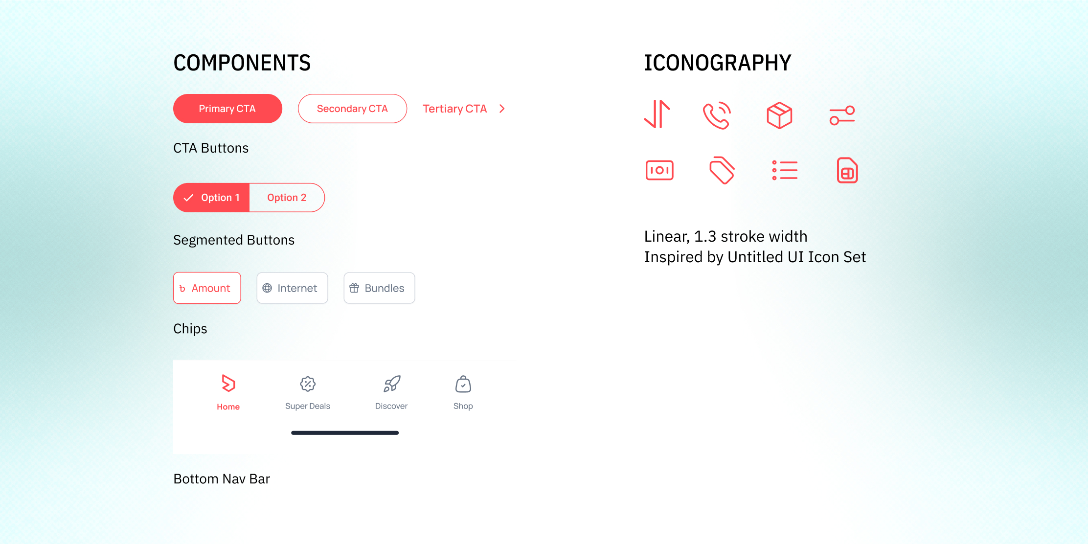
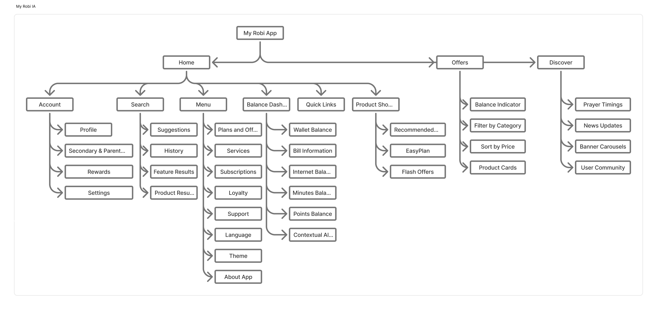
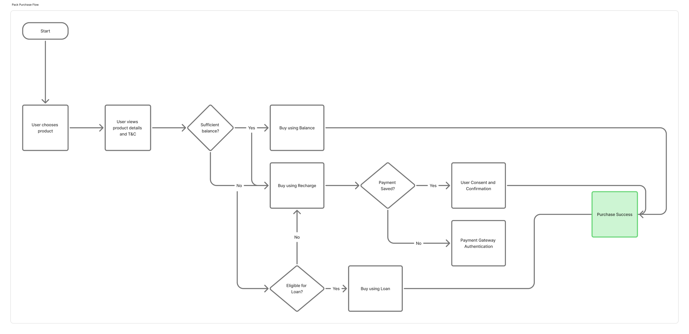
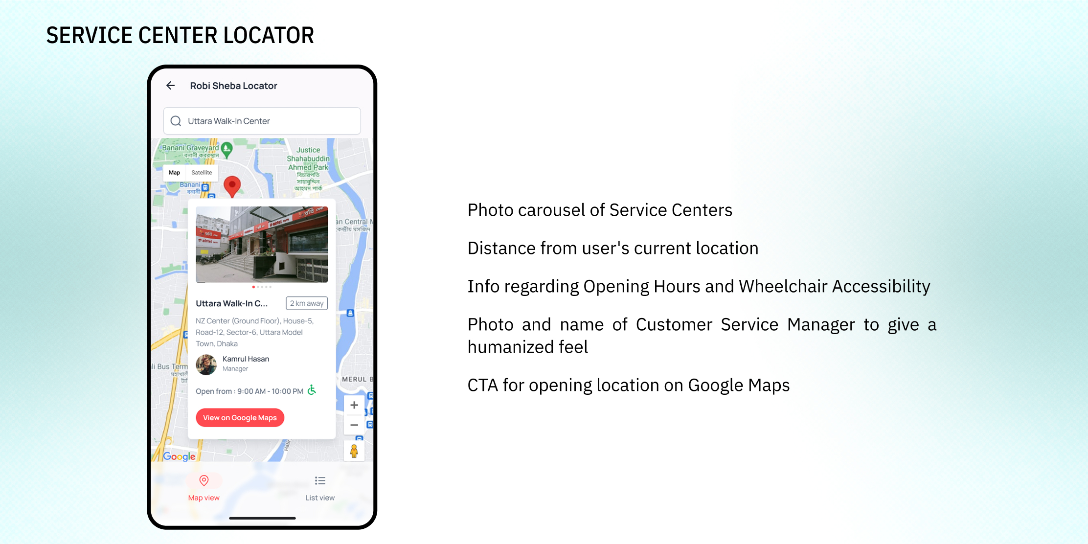
Information Architecture & User Flows
Information Architecture
Product Purchase User Flow
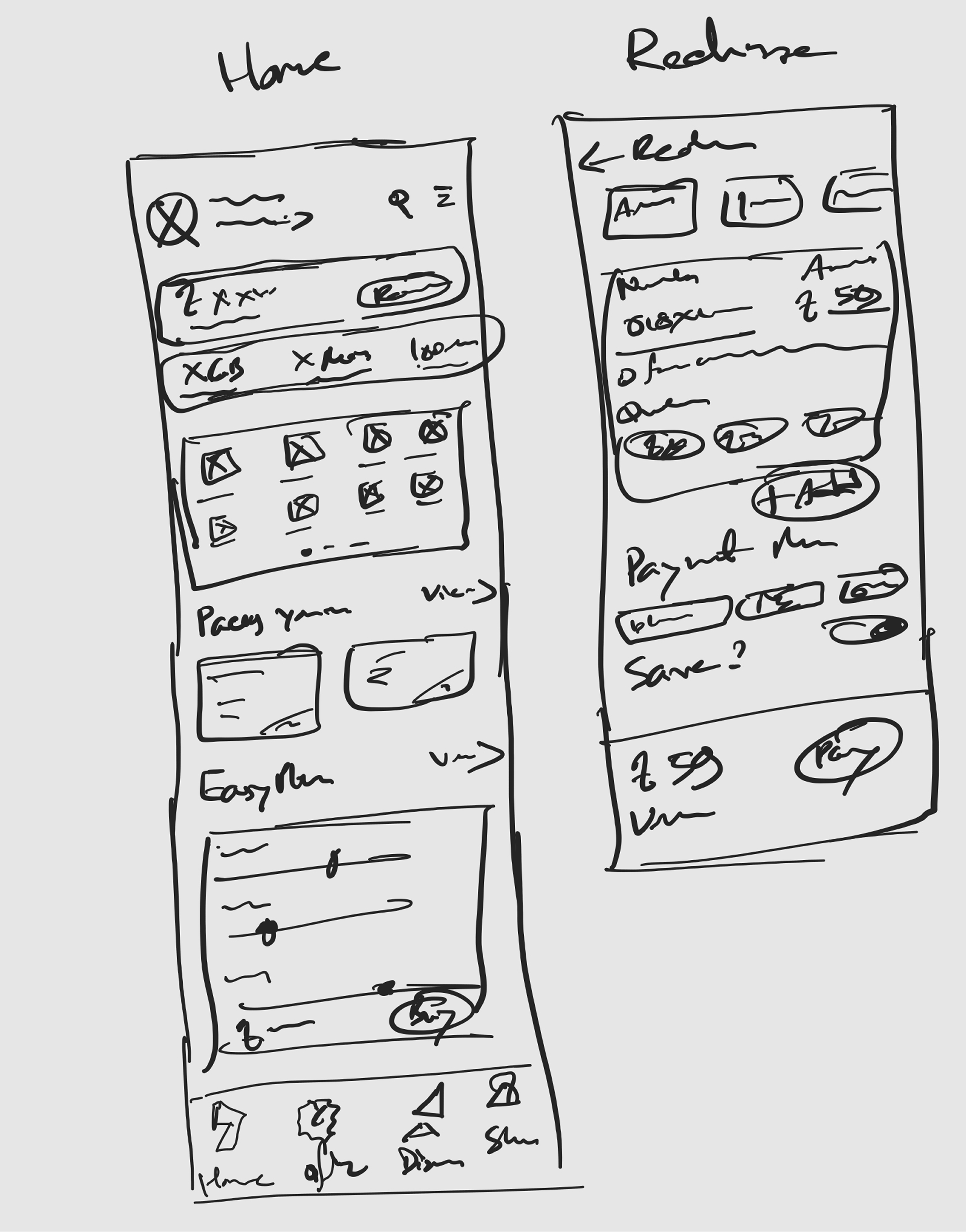
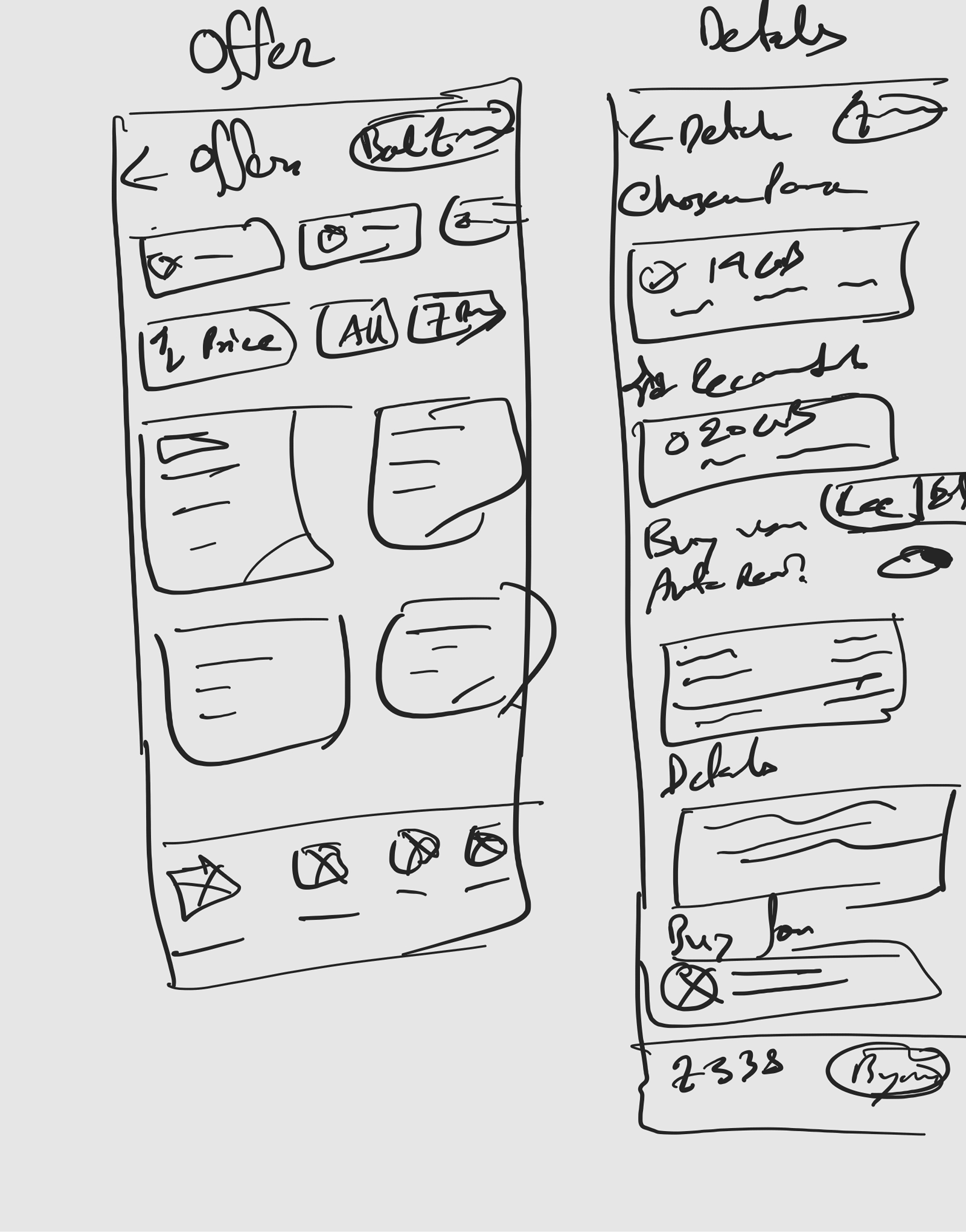
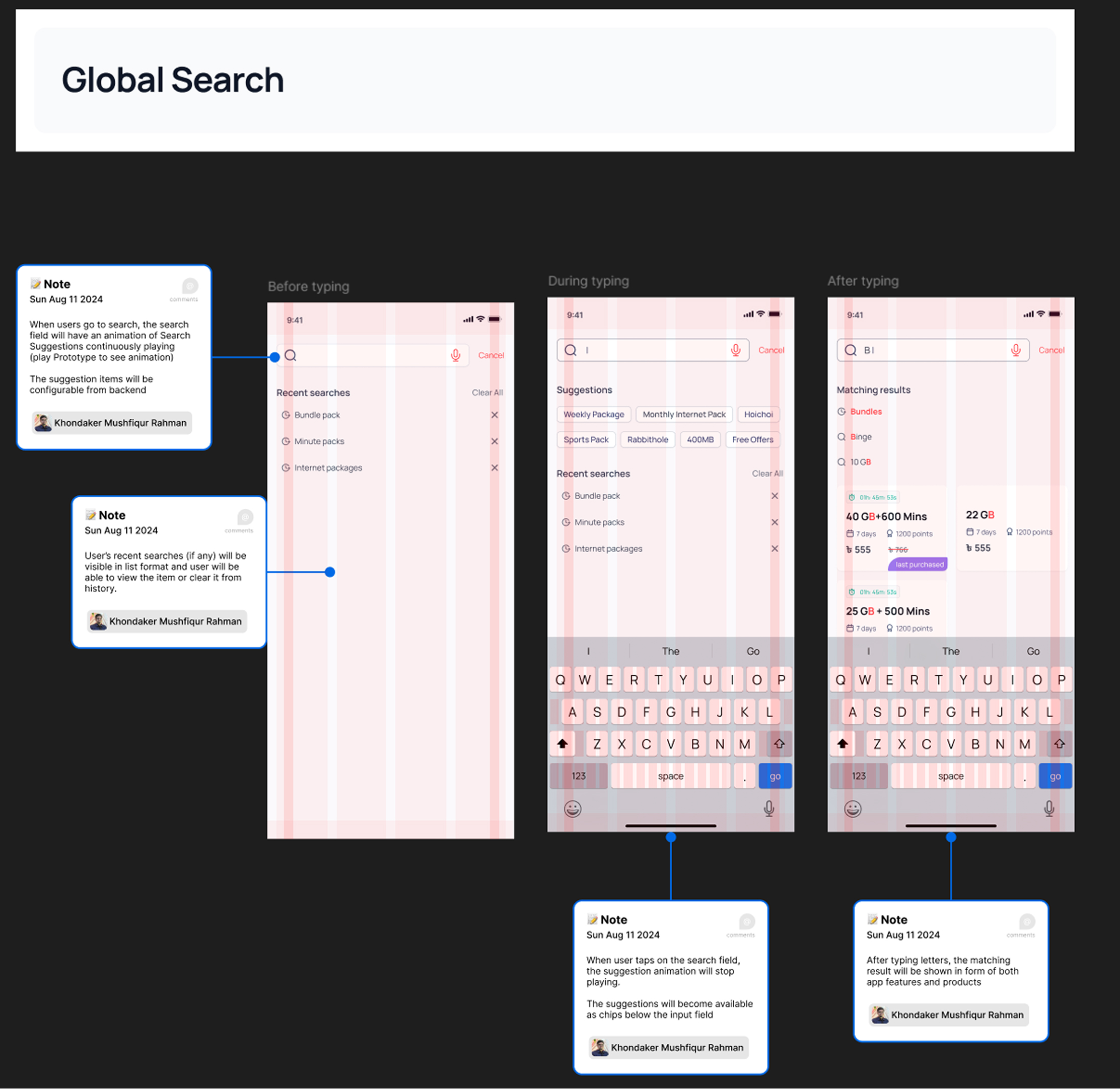
Wireframes

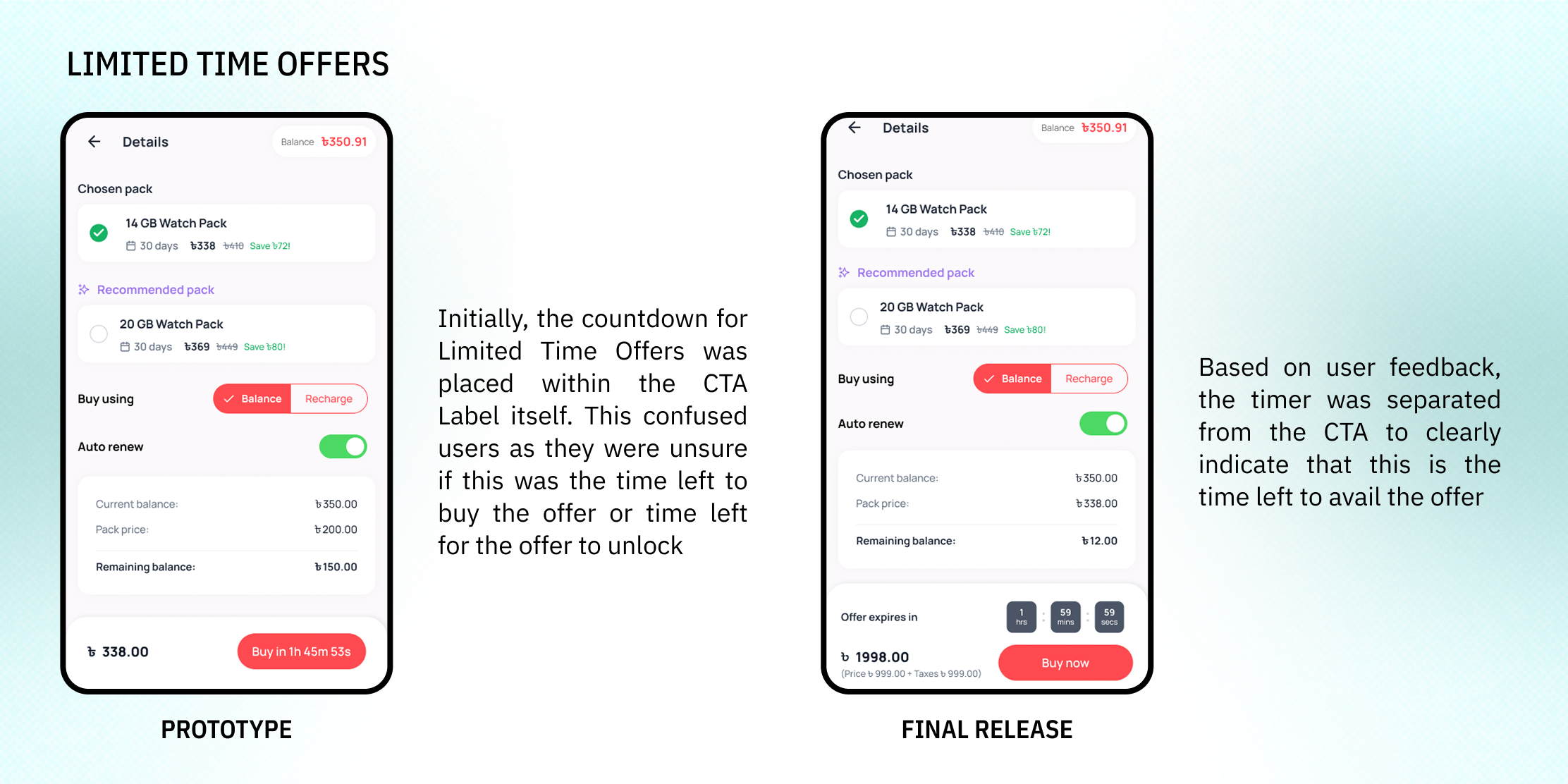
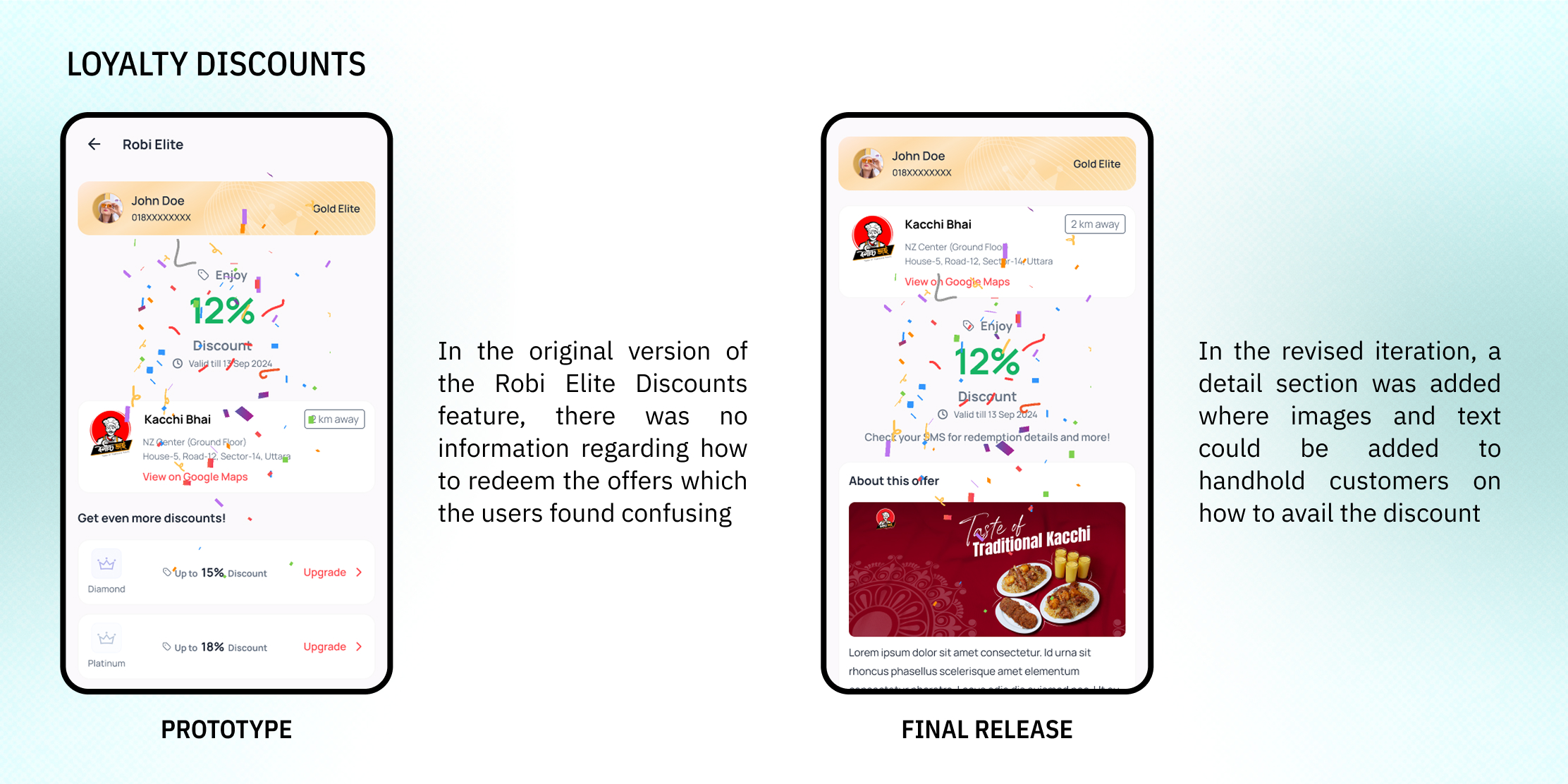
Solutions

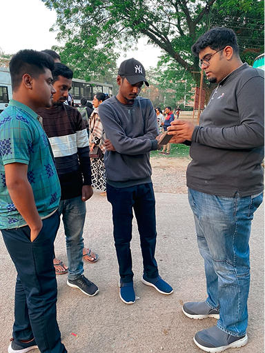
Evaluative Research
Upon preparing prototypes of potential solutions, the team travelled to different parts of Bangladesh (for instance, I visited Sylhet) to conduct contextual inquiries and collect initial feedback.

Accessibility Considerations
48dp Touch Target Sizes (aligning with Material Design 3)
24dp spacing between interactive elements
Default Bangla localization
Using 60-30-10, Dark Mode and muted colors to reduce eye strain
Dev Handoff
Behaviors and backend logics explained in Figma Annotations
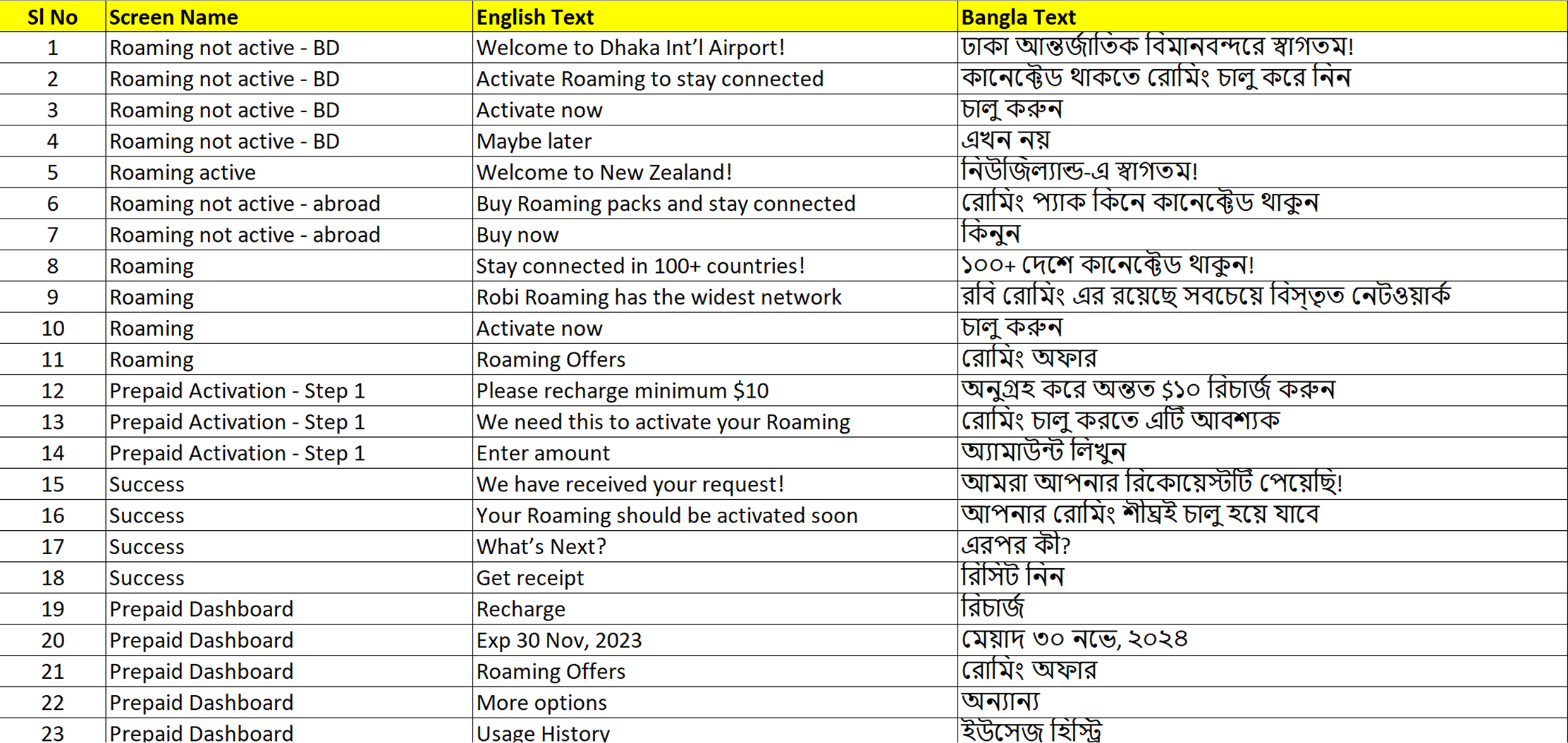
Localization strings as Excel files
PowerPoint Presentation explaining Motions and Interactions

Outcomes
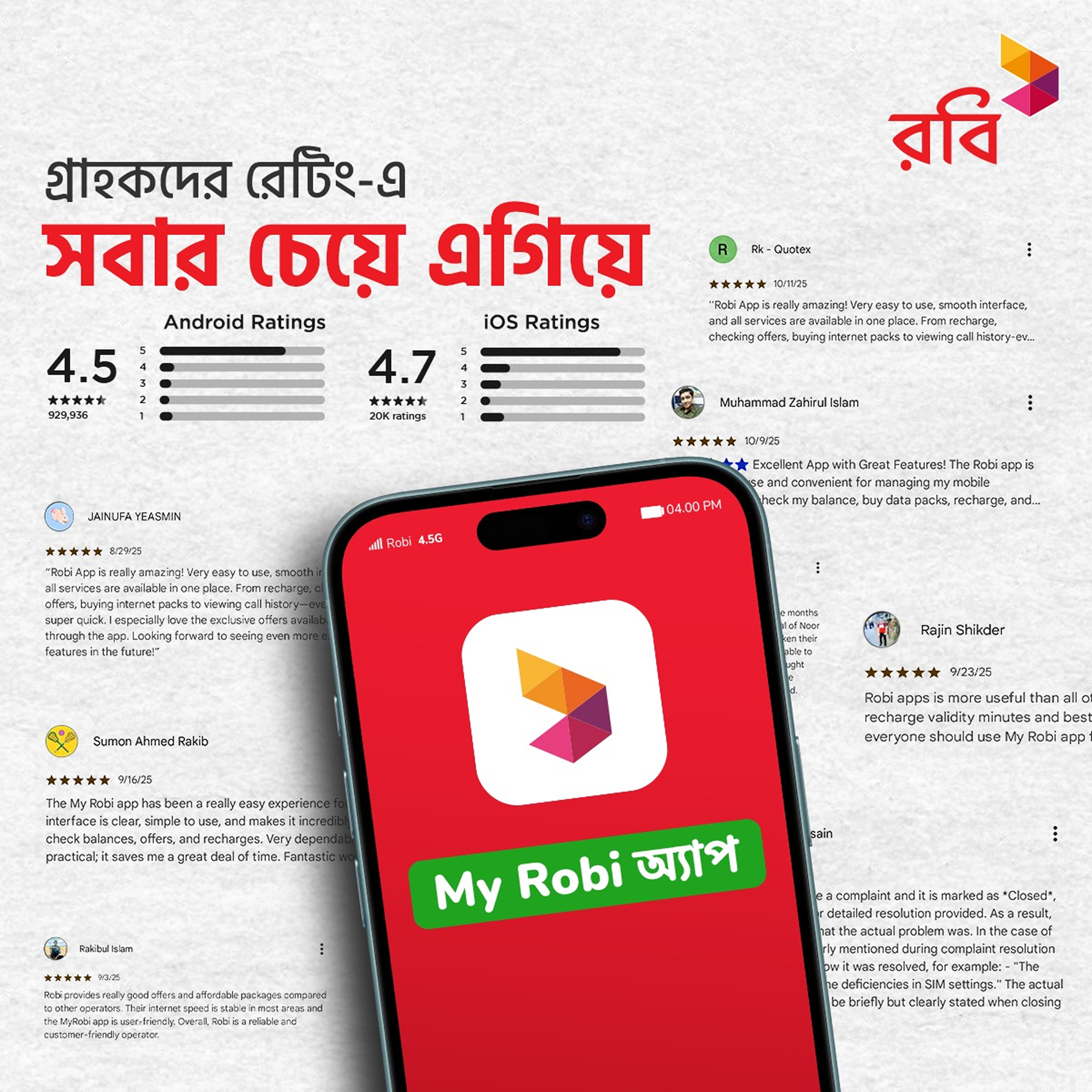
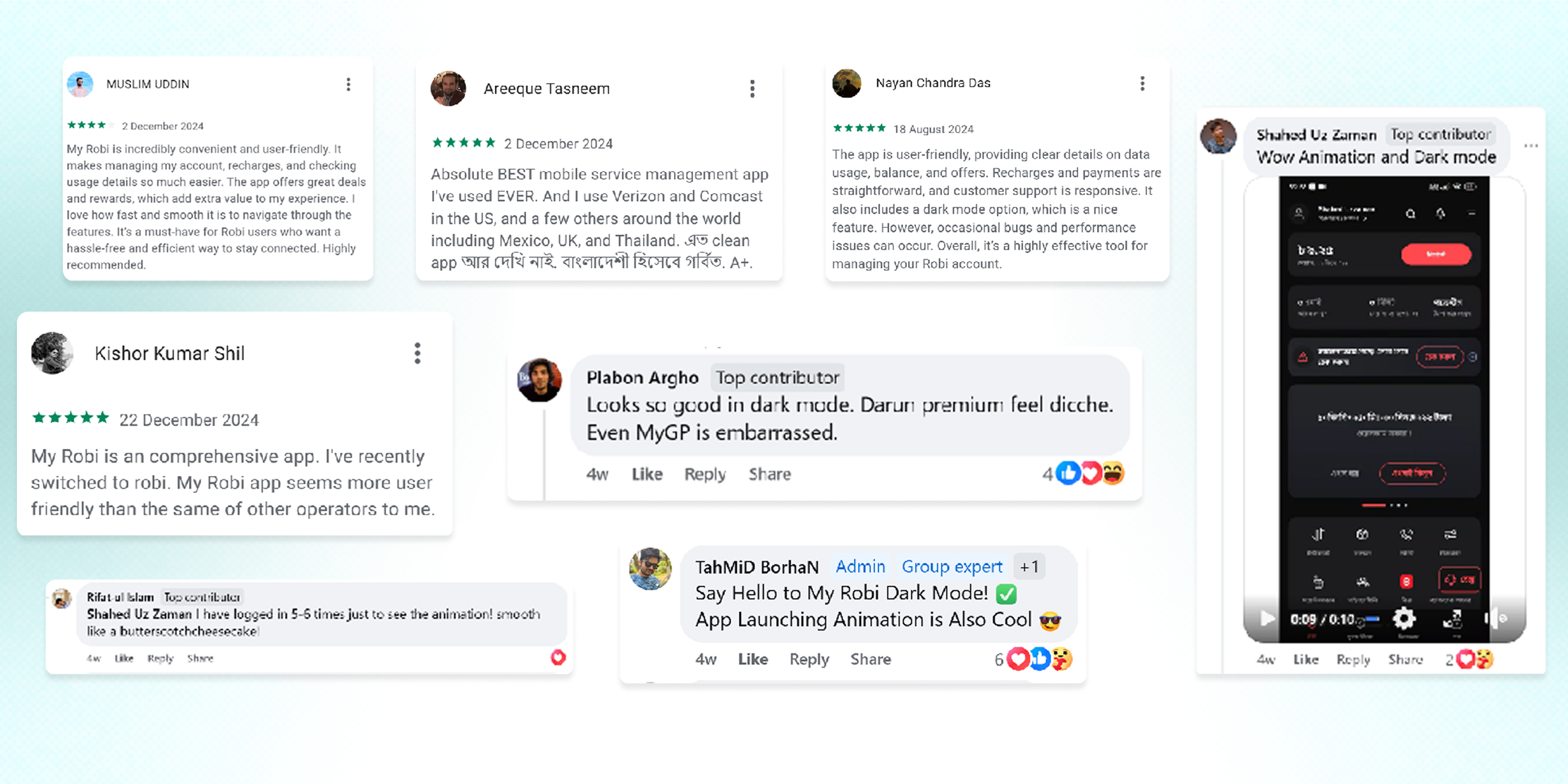
Play Store Rating increased from 4.1 to 4.8
21 MN+ Monthly Active Users (from 13.88 MN)
25% Company Revenue Contribution (from 10%)
18% Uptick in Average Revenue per User (ARPU)
35% drop in User Complaints
38% Y-o-Y Revenue Growth
Highest User Satisfaction in Bangladeshi Telco Industry
Positive Social Media Sentiment and Google Play Store Reviews
Retrospective
What I Learned
Users may have eccentric unmet needs
We would not be able to identify need gaps such as users feeling the need to know the “age” of their SIM cards without User Research
Iterative improvements triumph over major overhauls
Redesigning experiences in small-scale iterations allow for more precise problem solving than trying to overhaul the end-to-end experience at one go
Listen to users first and all else will follow
Prioritizing user feedback and pain points led to the meteoric rise in user satisfaction of the app
Challenges/Trade-Offs
Minimalism vs User-Friendliness
Sometimes trying to design clean, minimal UI left out information vital for users to make informed decisions
Aesthetics vs Accessibility
Using subtle, muted colors improved the aesthetics of the UI but also led to poor contrast in certain cases
Micro-Management and Corporate Interference
Especially during the initial phases of the project, there was heavy micro-management and C-suite involvement in design decisions
What would I do differently now?
Redesign one feature at a time
Instead of overhauling the entire app which has 100+ features at one go, I would prioritize critical features and work on improving them in smaller, more focused iterations
Focus more on delightful experiences
While this project satisfied user needs, looking back I feel like the designs lack delight, joy or “coolness”. I would definitely incorporate more playful copywriting, micro-interactions and hyper contextualization to ensure the app experience not only satisfies but also delights users
Perform Contrast Checks
Ensure backgrounds and foregrounds have sufficient contrast as per WCAG standards
Set boundaries and expectations
Setting up boundaries and expectations at the outset of the project would potentially avoid issues of micro-management and corporate interference and empower the design team to make design decisions independently


4+ Years in PRODUCT DESIGN
HCIM STUDENT @ UMD