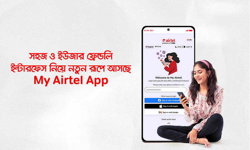
My Airtel App


My Airtel App
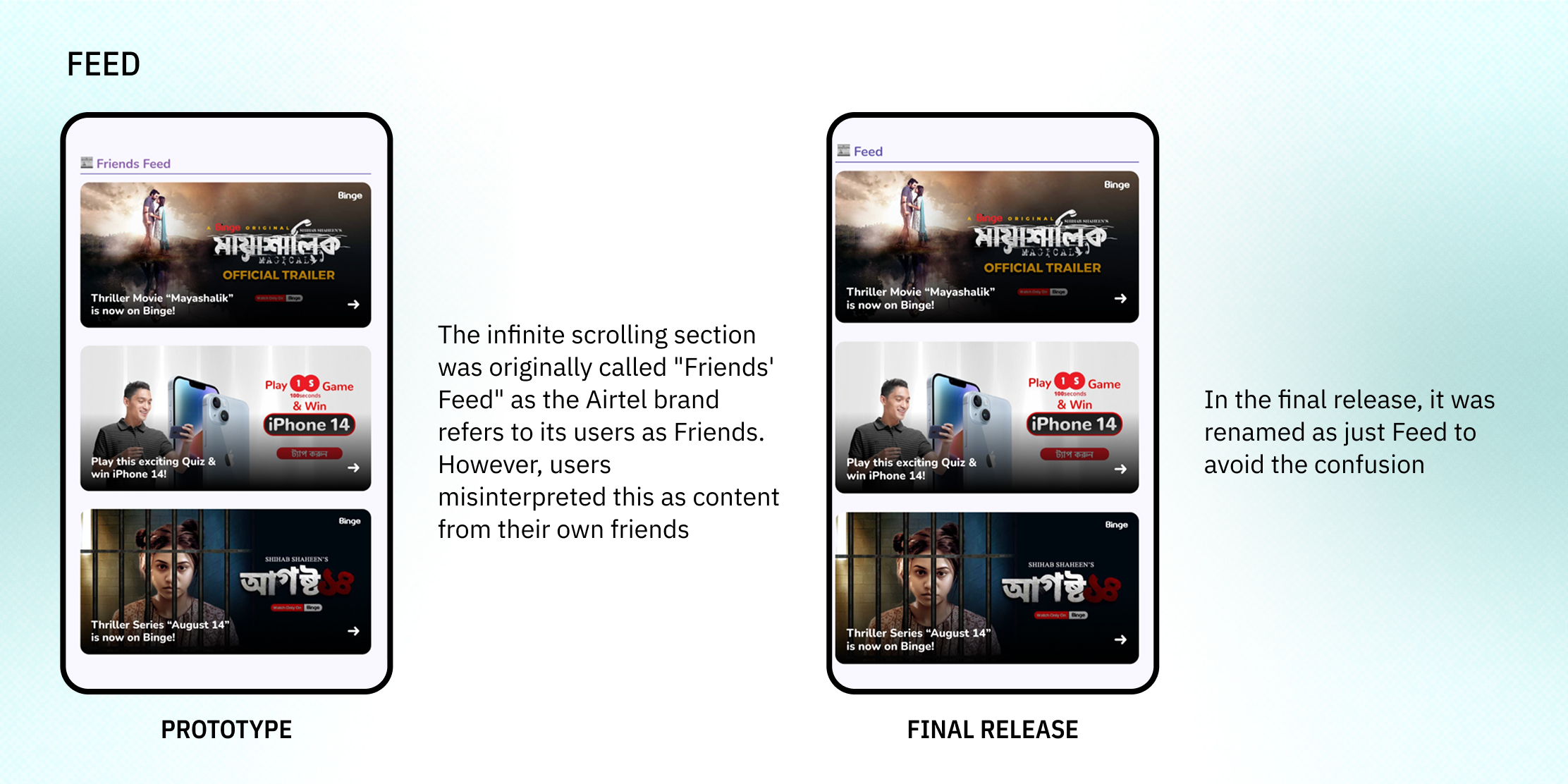
Heuristically Healing a Sub-Brand
Following a merger between Robi Axiata and Airtel in Bangladesh, the company adopted a dual-brand strategy where the ‘Robi’ brand caters to more mature audiences while the ‘Airtel’ brand serves the youth. However, maintaining this dual-brand strategy often led to discrepancies between the quality of services offered by the two brands with Airtel often lagging behind in terms of its offerings. This led the Airtel subscriber base to feel like they are being neglected and brand loyalty was dwindling. The purpose of this redesign was to resolve Airtel users’ pain points with the app and make them feel valued.
Year
2023
Industry
Telecommunications
Scope
UX Research
Interaction Design
UI Design
Individual Roles
Sole UX Researcher, Designer and Writer
Wireframing
Prototyping
Management Updates
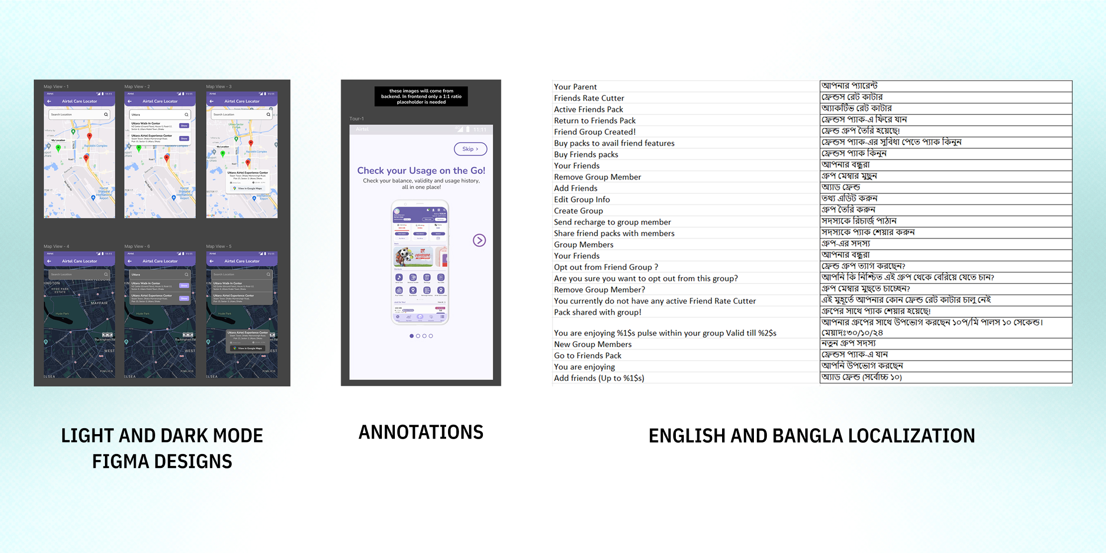
Localization
Dev Handoff and Grooming

Problem Statement
The existing My Airtel app was misaligned with its youthful branding and plagued by broken and incomplete user flows. Management mandated an urgent overhaul with a strict 3-month launch window, leaving me under four weeks to execute a comprehensive and delightful redesign
Tools
Microsoft Excel (for data analysis)
Figma (for Designing & Prototyping)
Microsoft PowerPoint (for slide decks)

Vision
Reimagining My Airtel as a seamless, youth-centric digital experience that makes Airtel users feel valued and understood

Values

Objectives
Repair broken user flows to create a stable, reliable experience
Realign the design language with "youth-first" brand strategy
Restore user satisfaction, engagement and loyalty

Target Audience
10 mn+ Airtel subscribers aged between 18-24 years who own Smartphones and regularly use Mobile Internet

Success Metrics
Monthly Active Users
Google Play Store/App Store Ratings
Y-o-Y Channel Revenue Growth
Reduction in Customer Complaints
Uptick in Average Revenue per User (ARPU)
Improvement in User Stickiness and Engagement

Key Highlights
8+ MN Monthly Active Users
Highest User Satisfaction in Bangladeshi Telco Industry
6x increase in Usage Session Times

Design Process
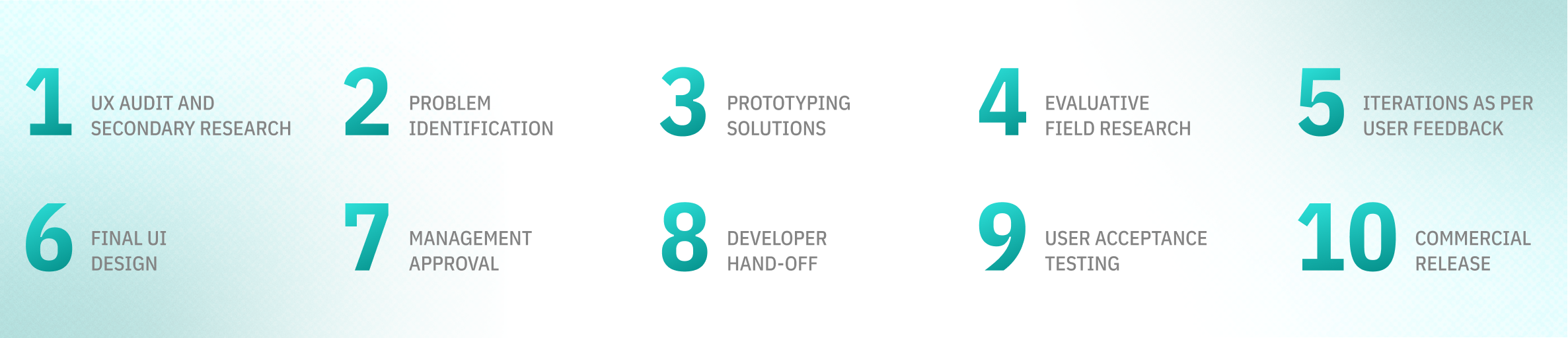

Discovery Phase
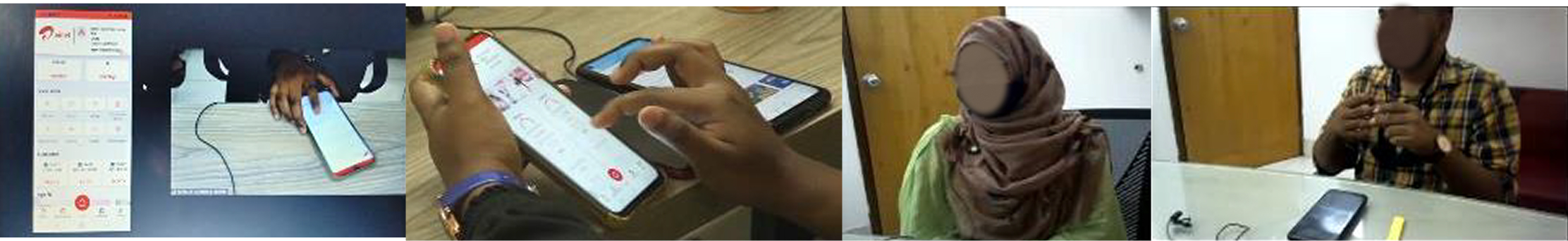
For the Discovery Phase, I conducted a Cognitive Walkthrough of the entire end-to-end app experience to identify UX issues. Contextual Inquiry with real users was also carried out to understand their pain points.
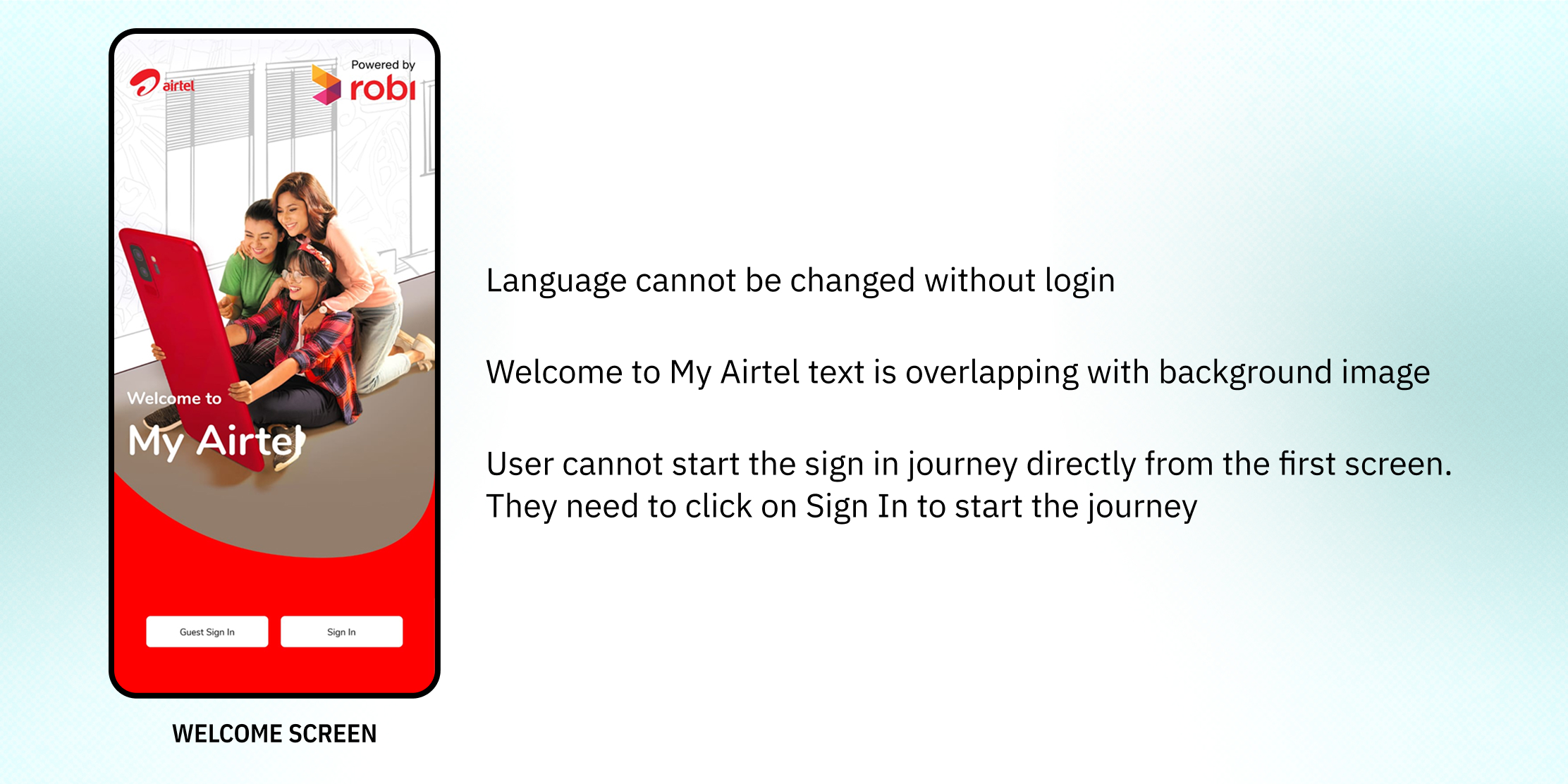
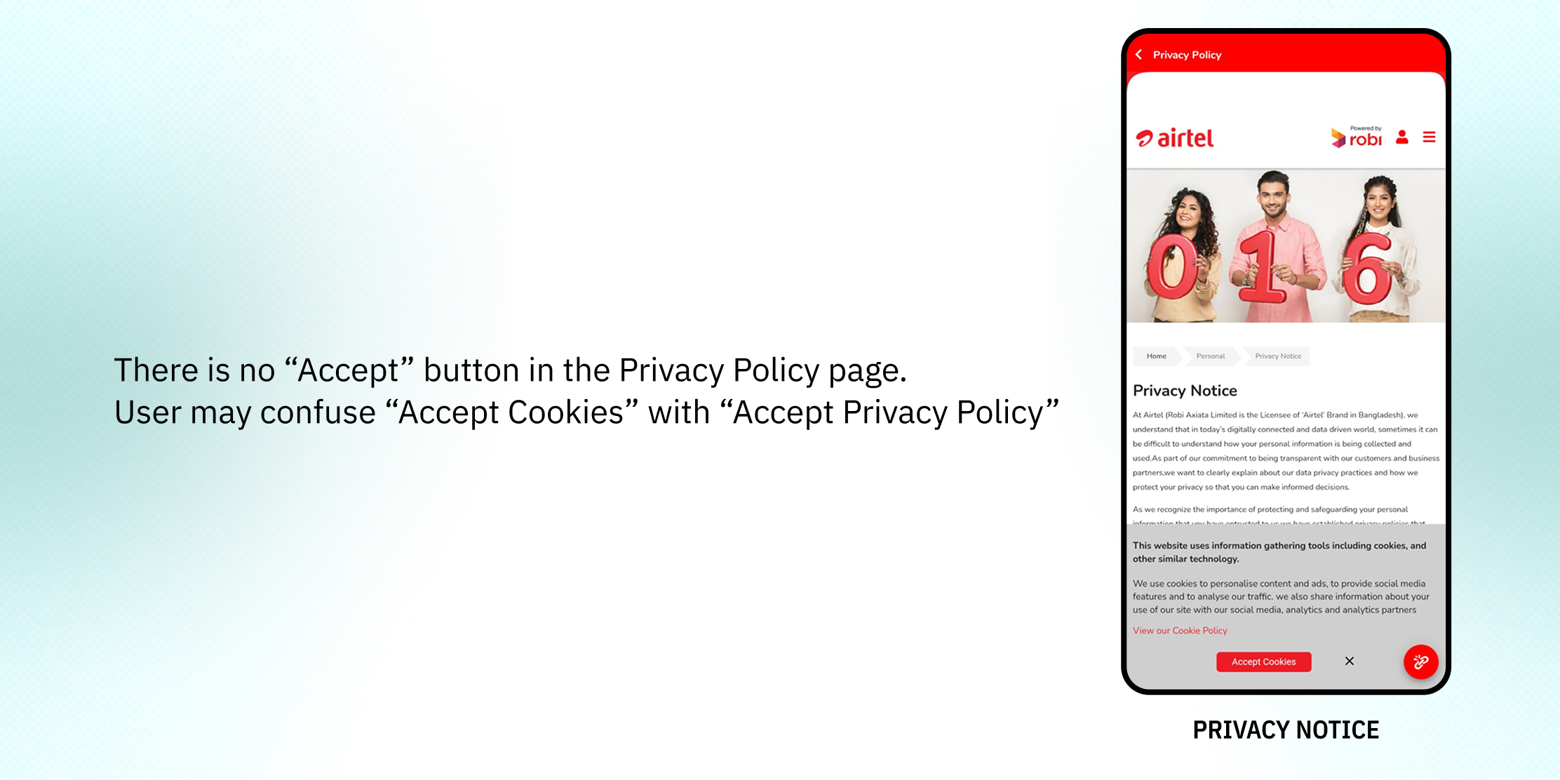
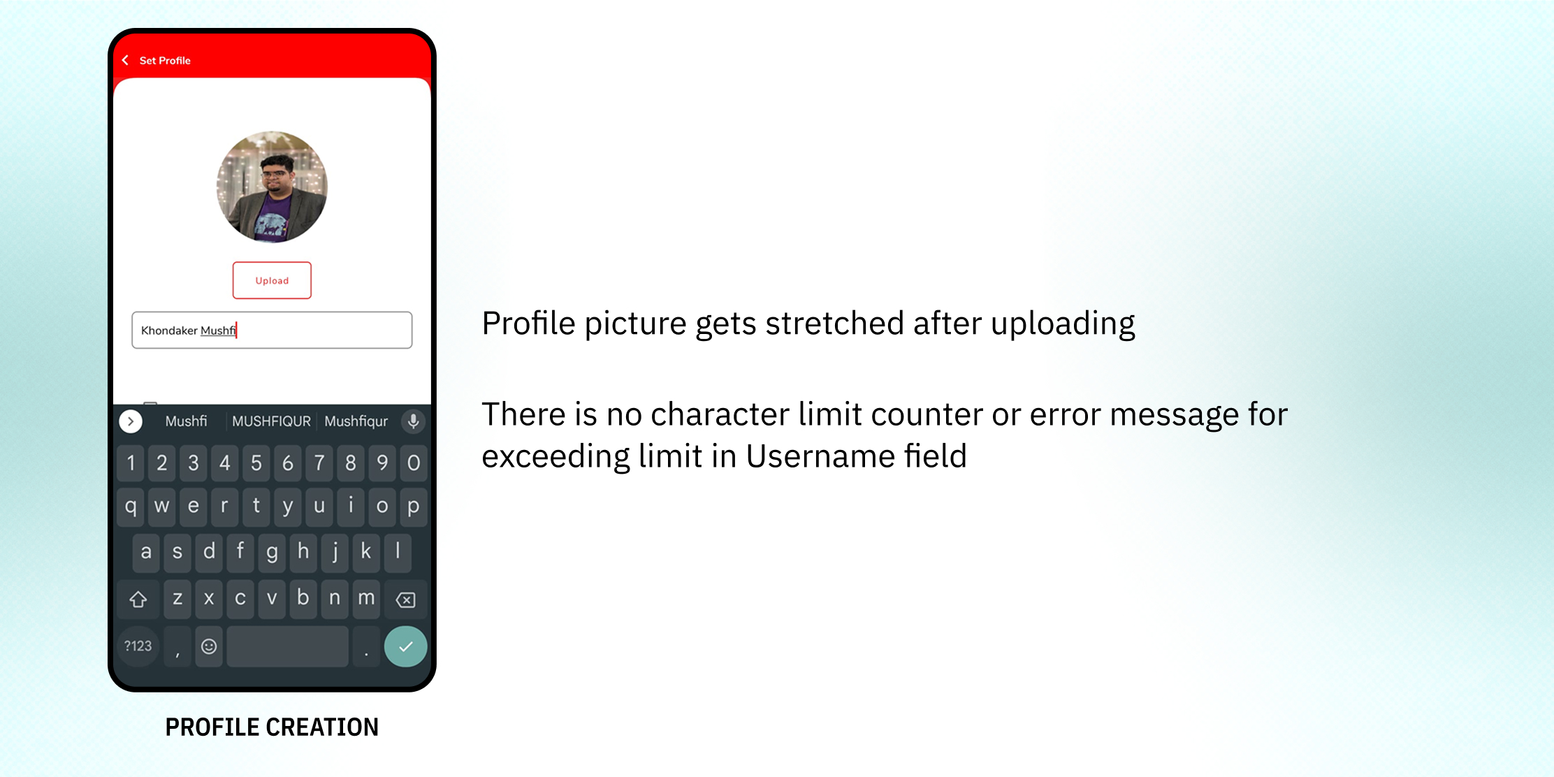
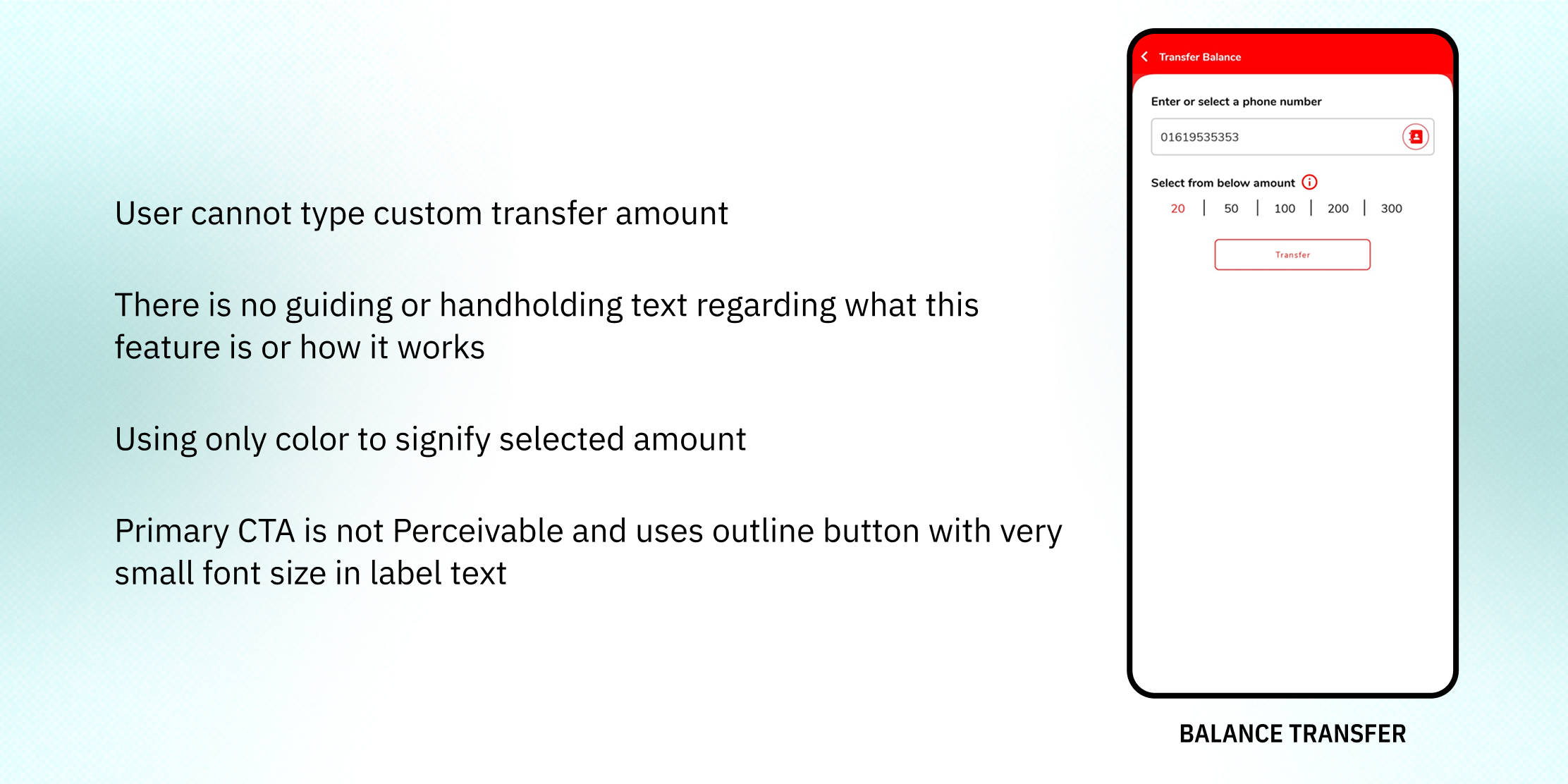
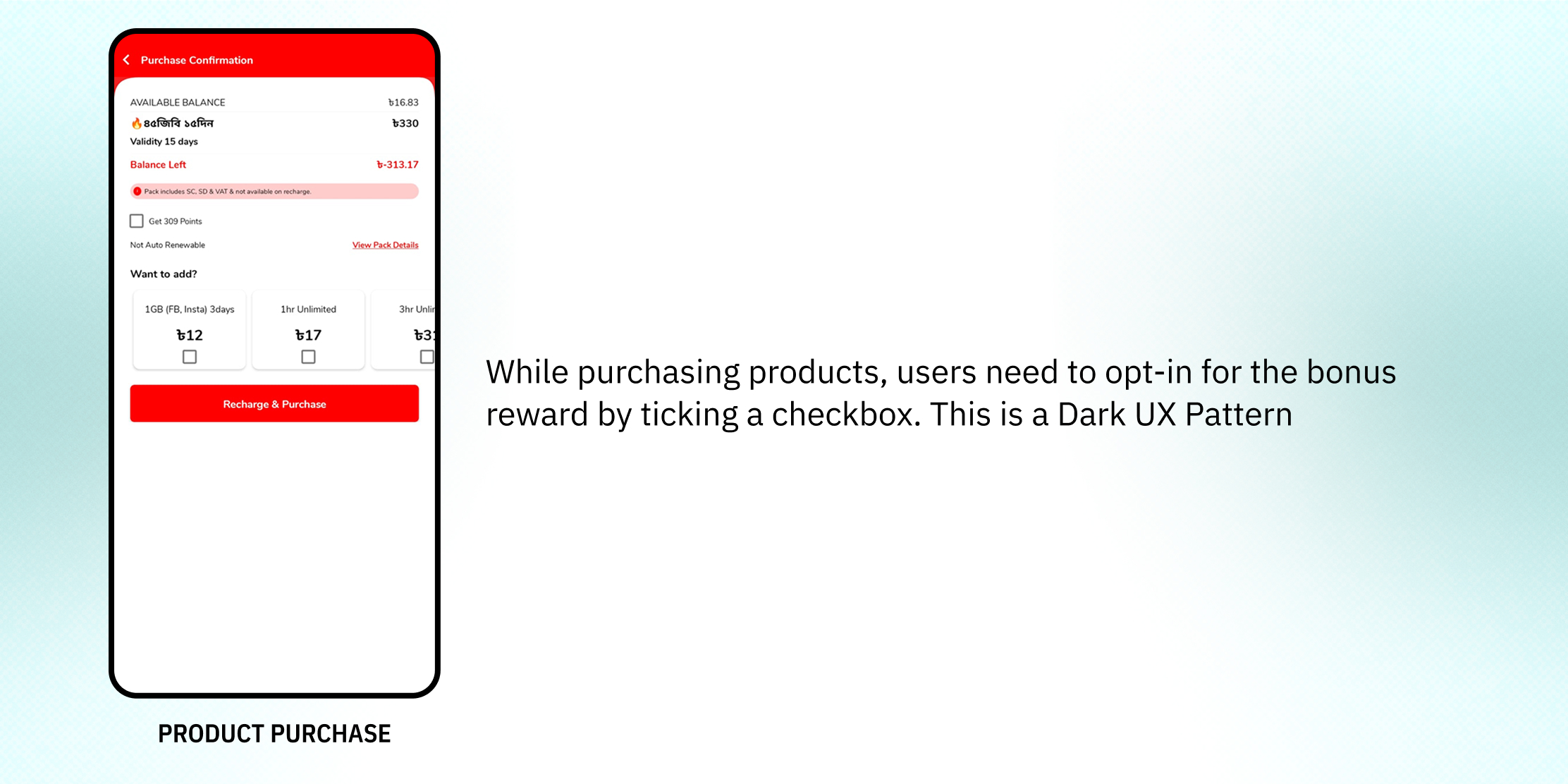
The cognitive walkthrough yielded 132 heuristic anomalies. Full detailed report can be found here.
Contextual Inquiries were conducted among 17 users belonging to both Biological Sexes in Dhaka City from Socio-Economic Classes (SEC) A, B and C aged between 18 to 24 years
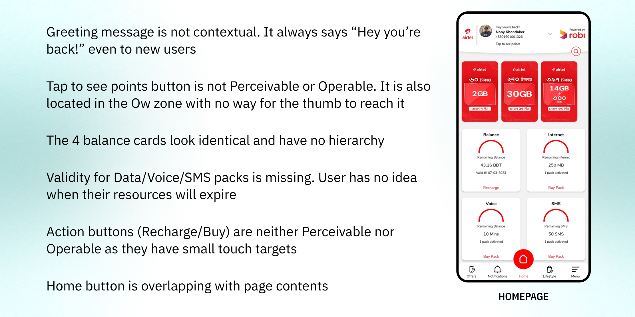
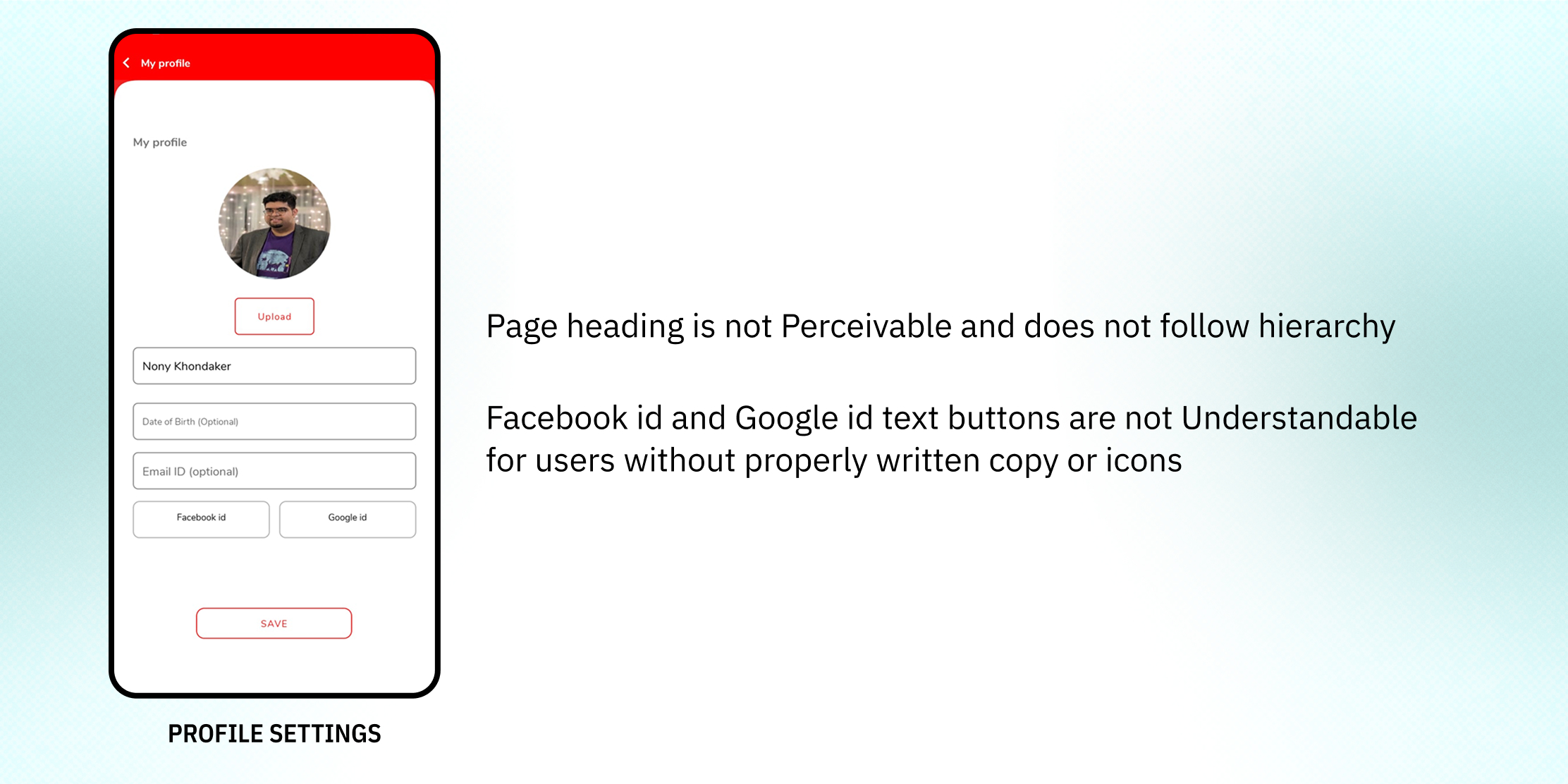
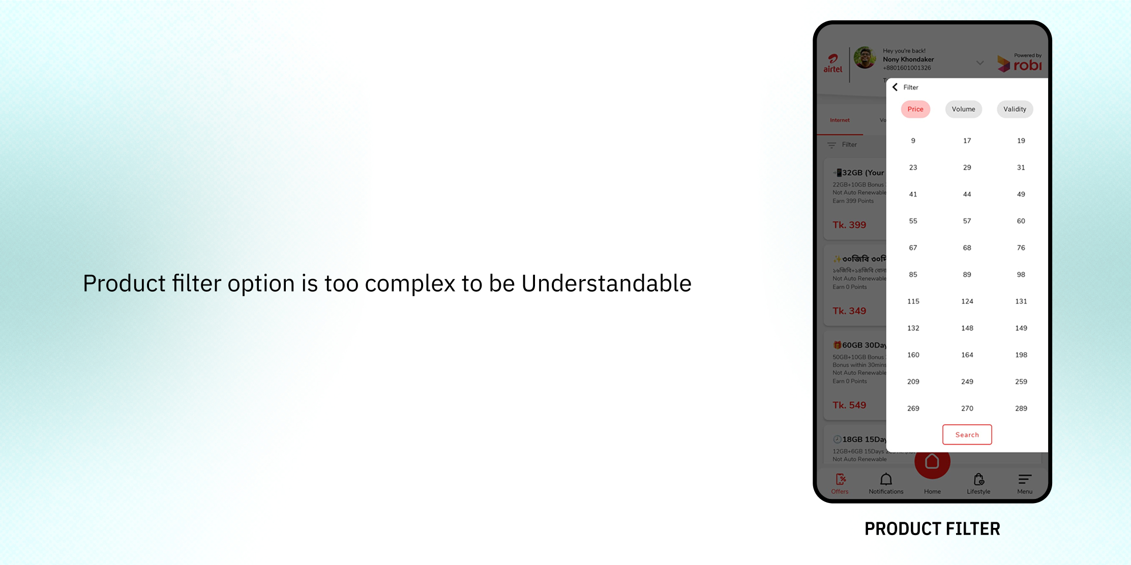
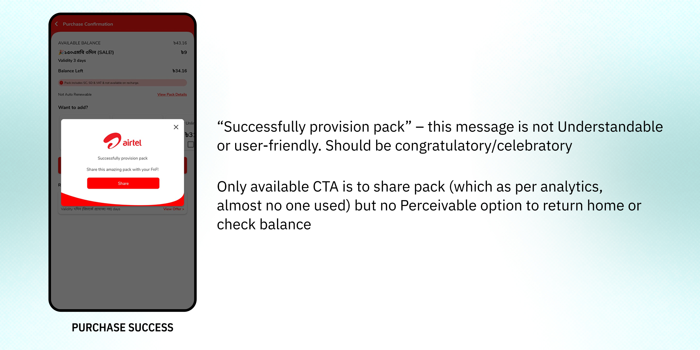
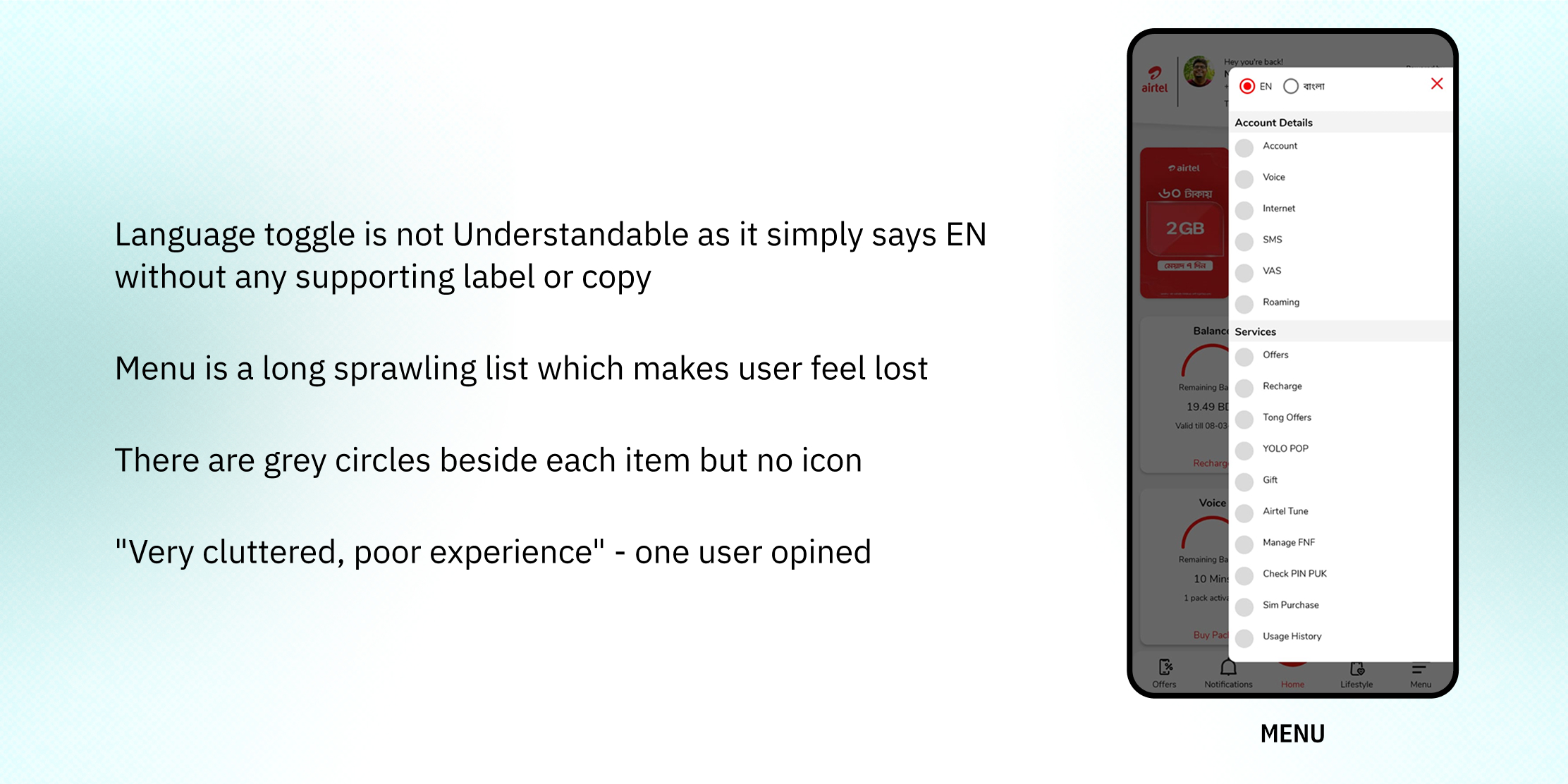
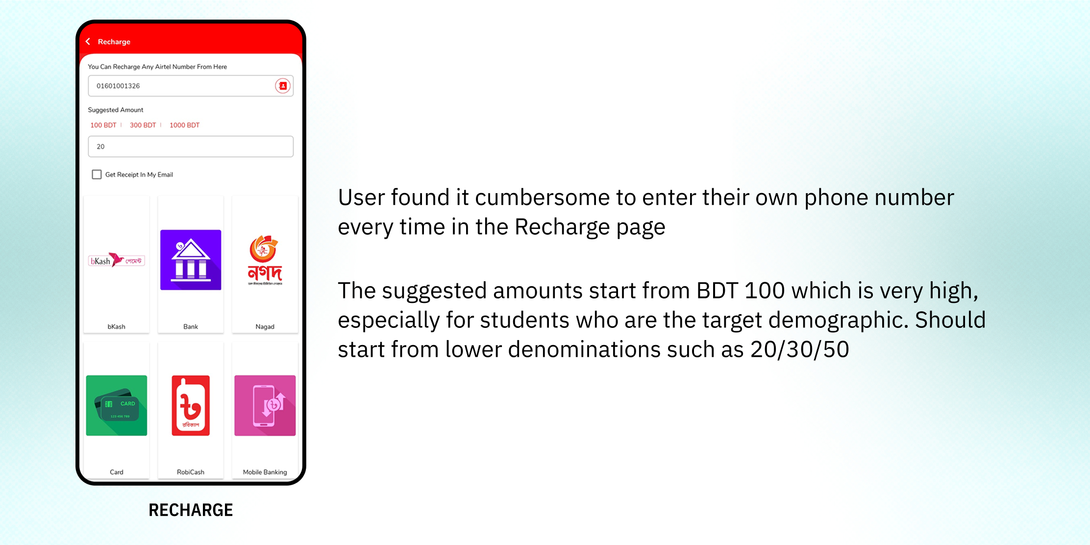
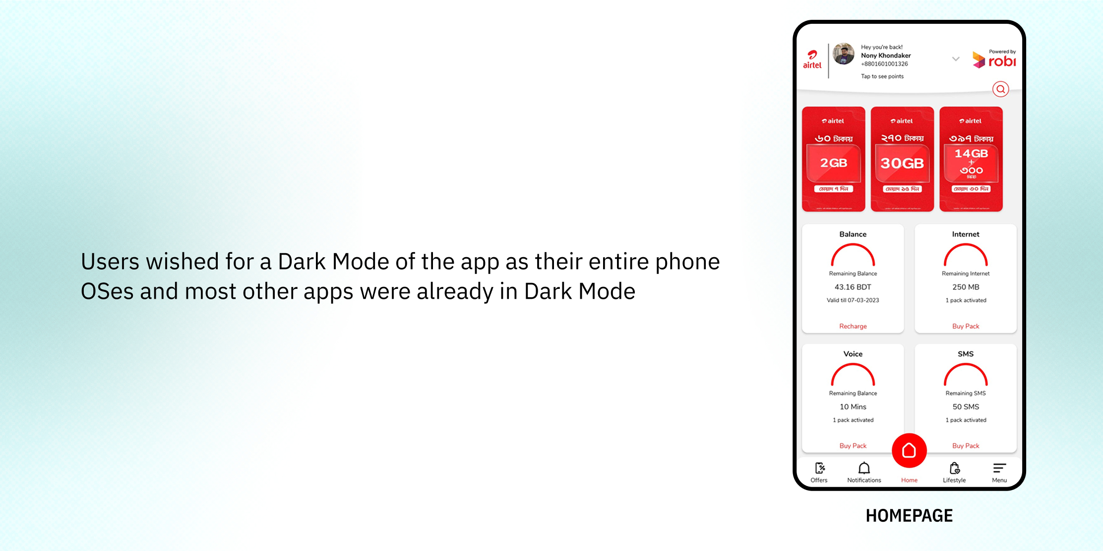
The Contextual Inquiry revealed some additional pain points-

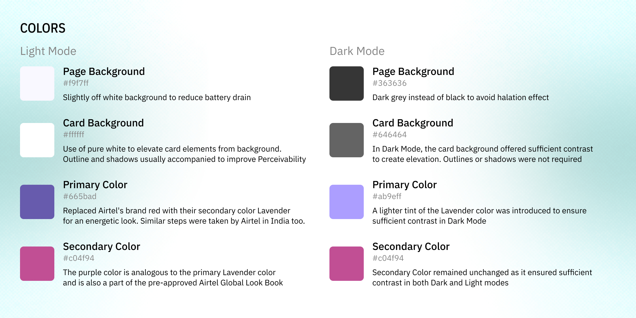
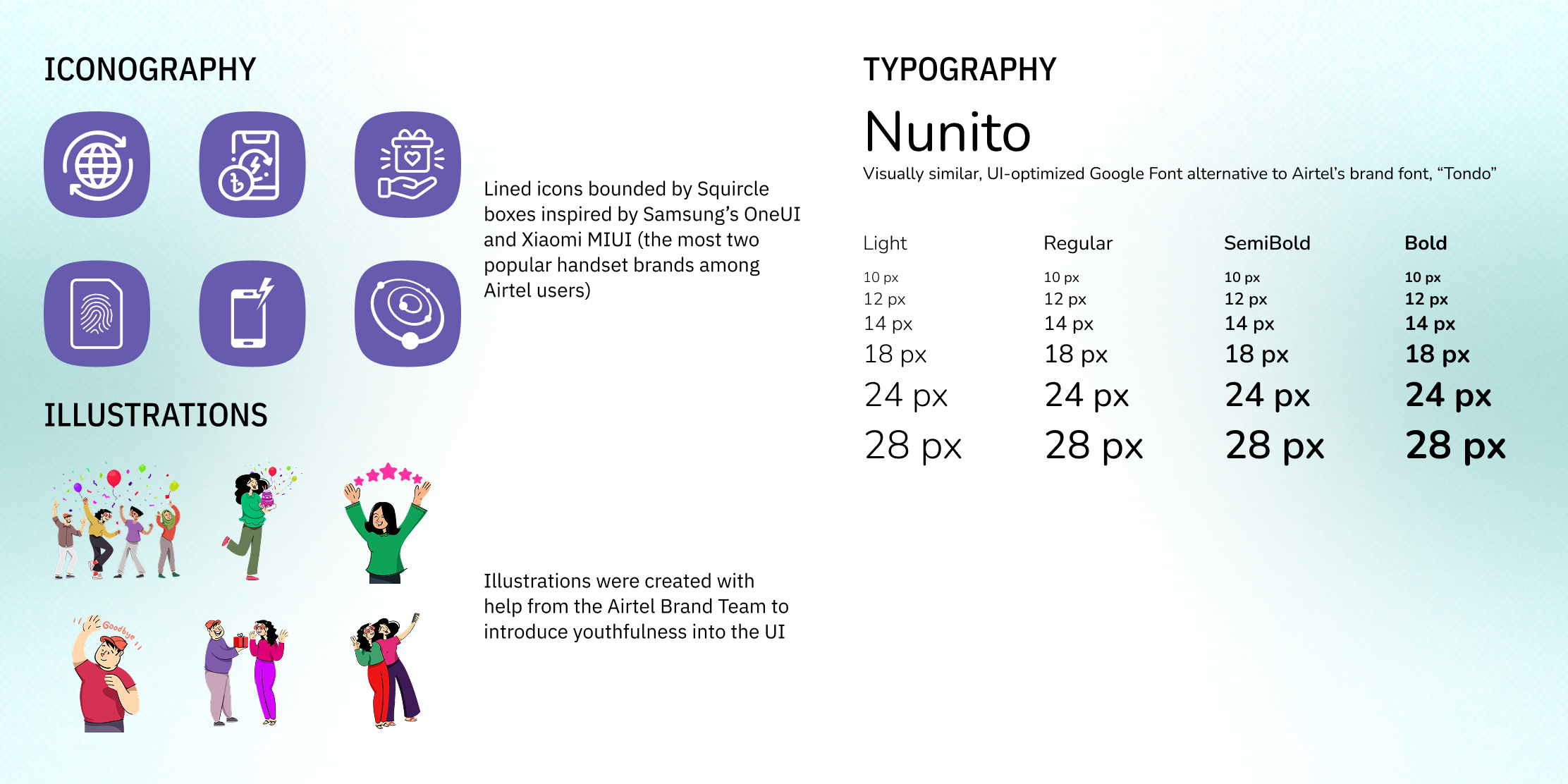
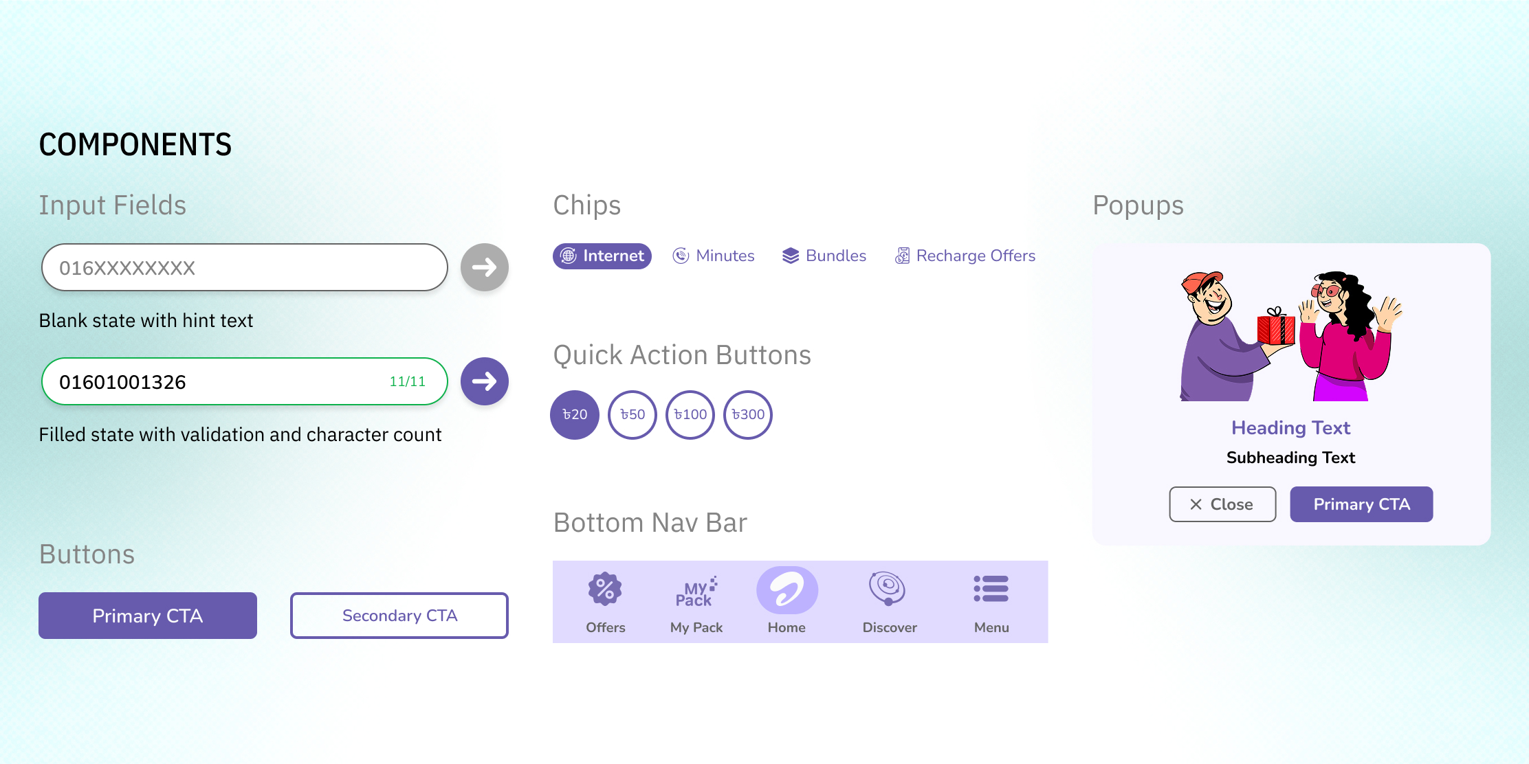
Design System / Style Guide

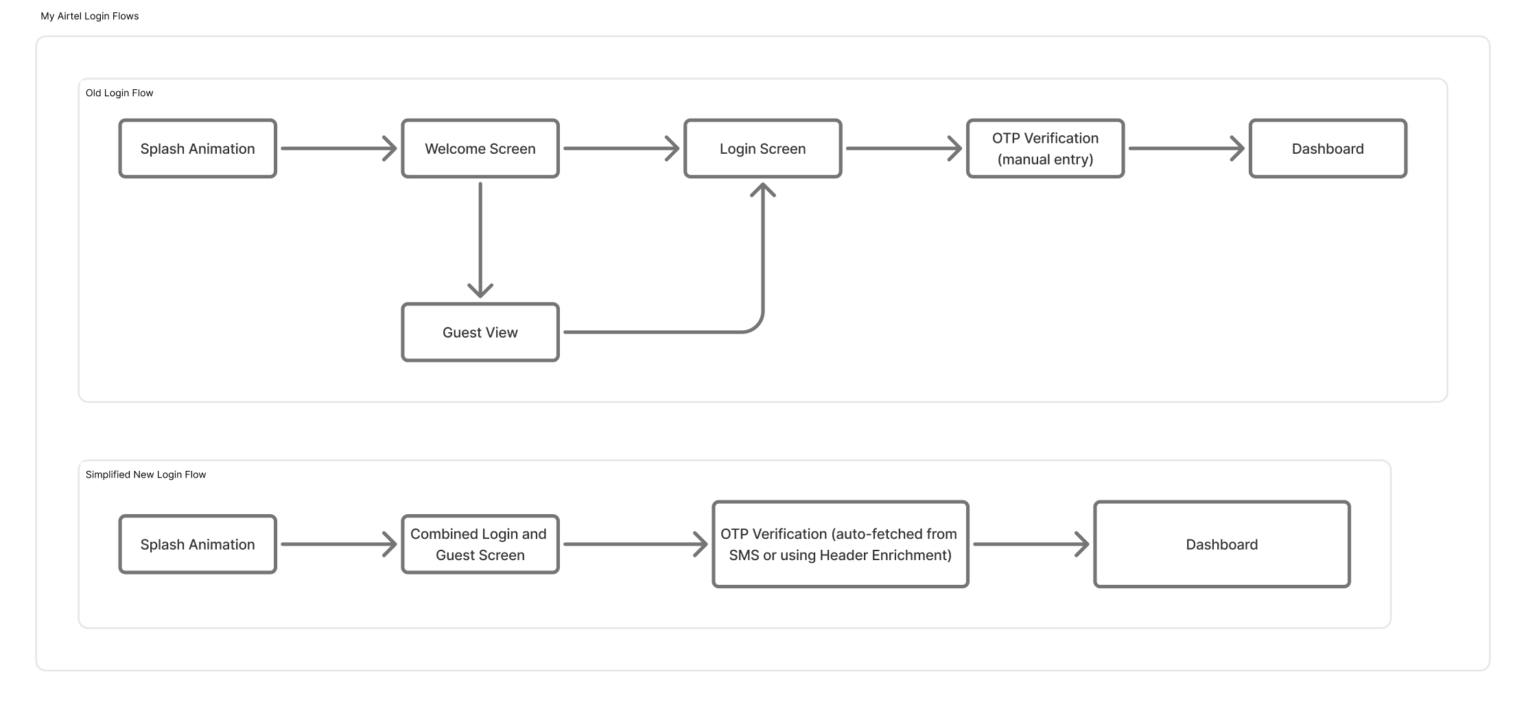
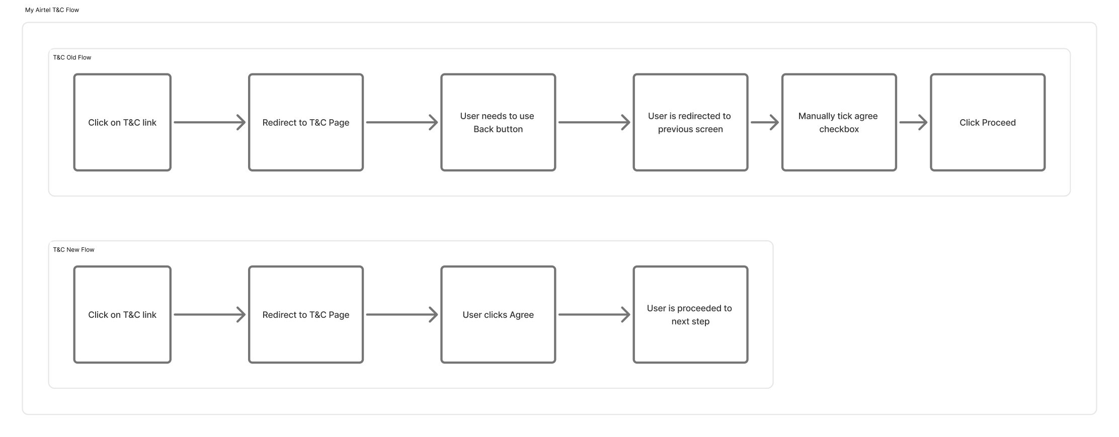
Information Architecture / User Flows

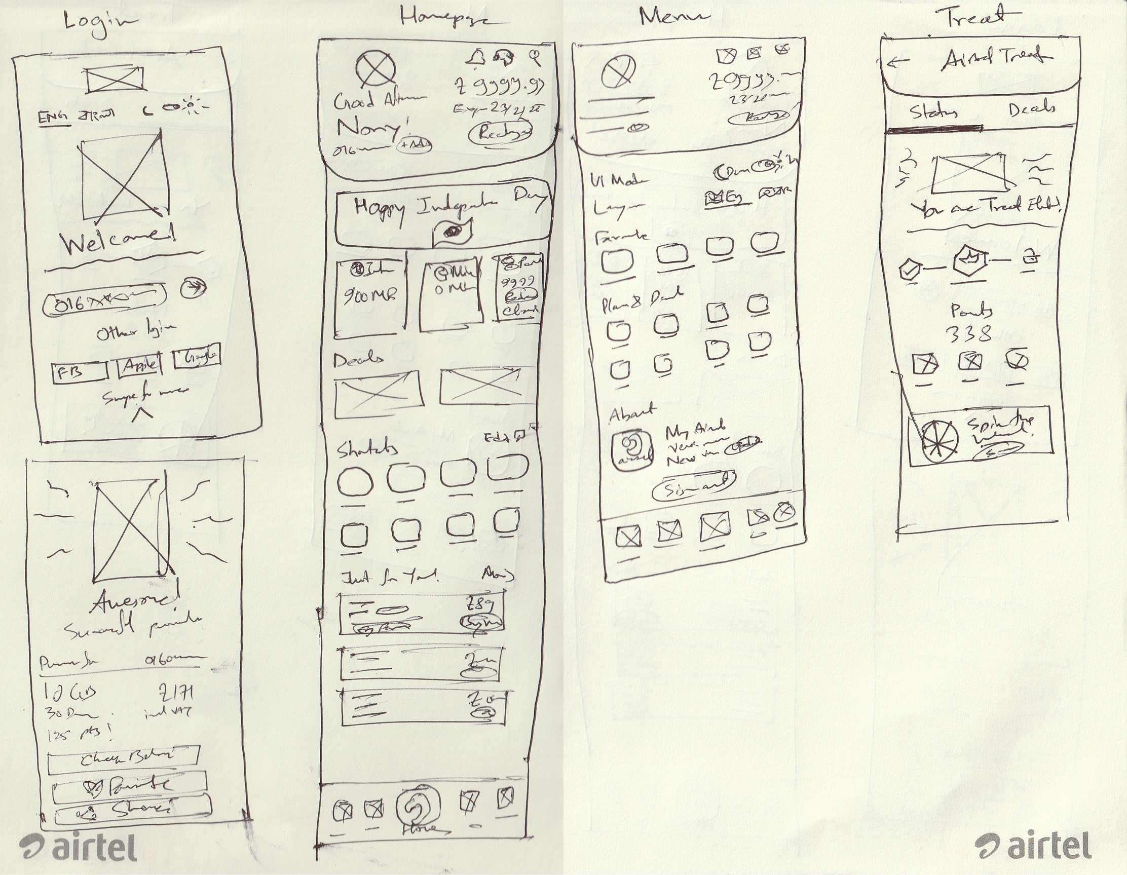
Wireframes

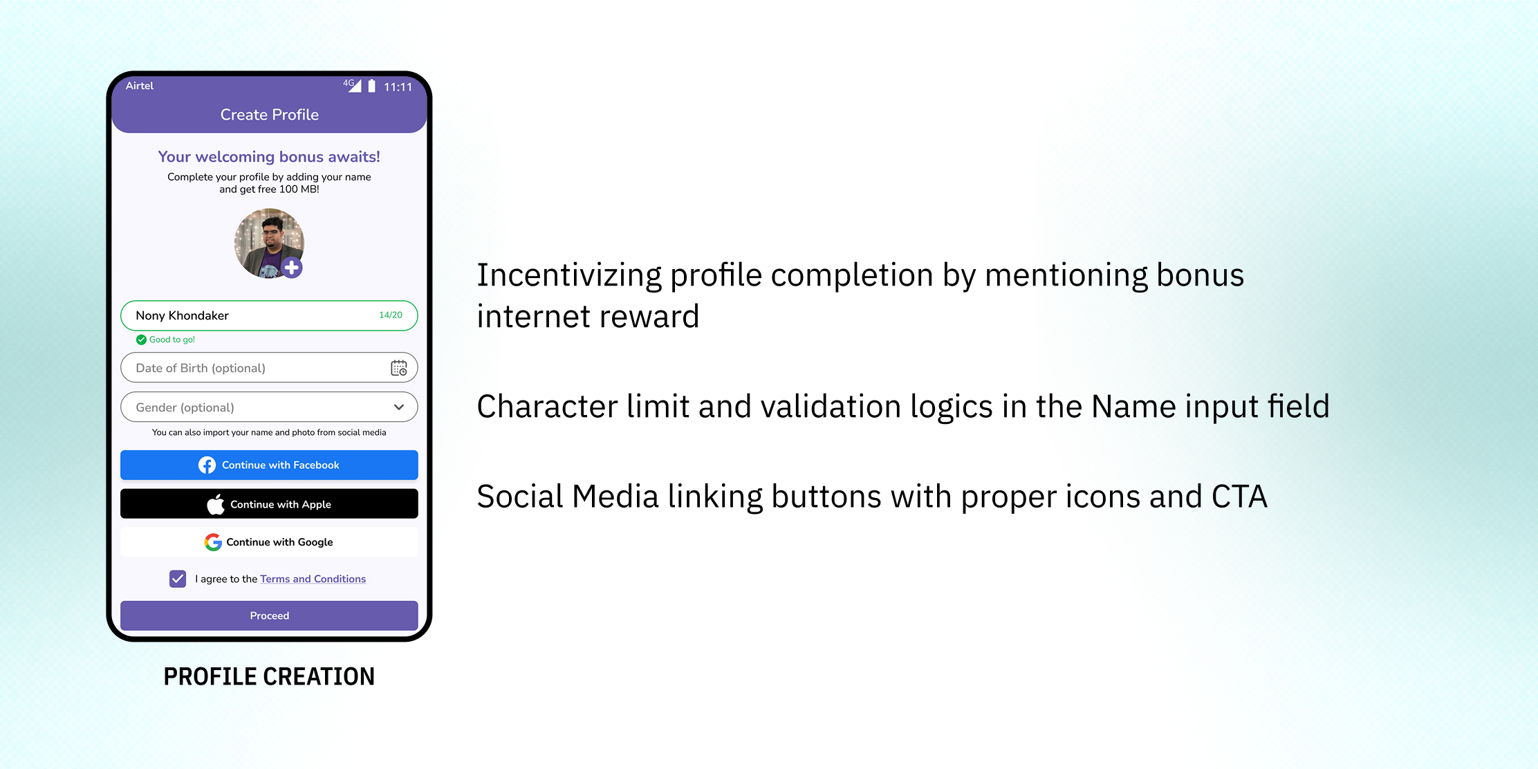
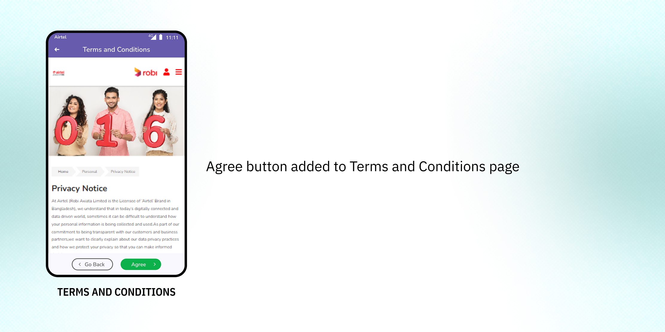
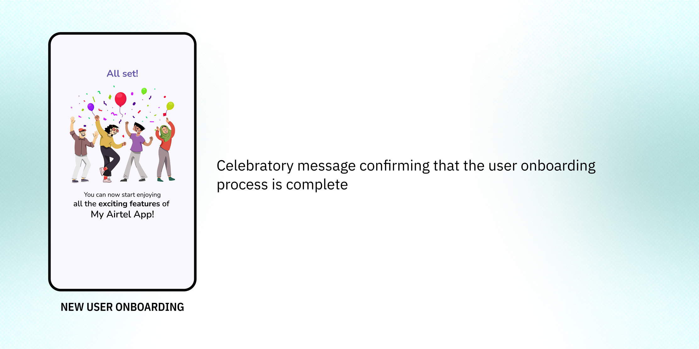
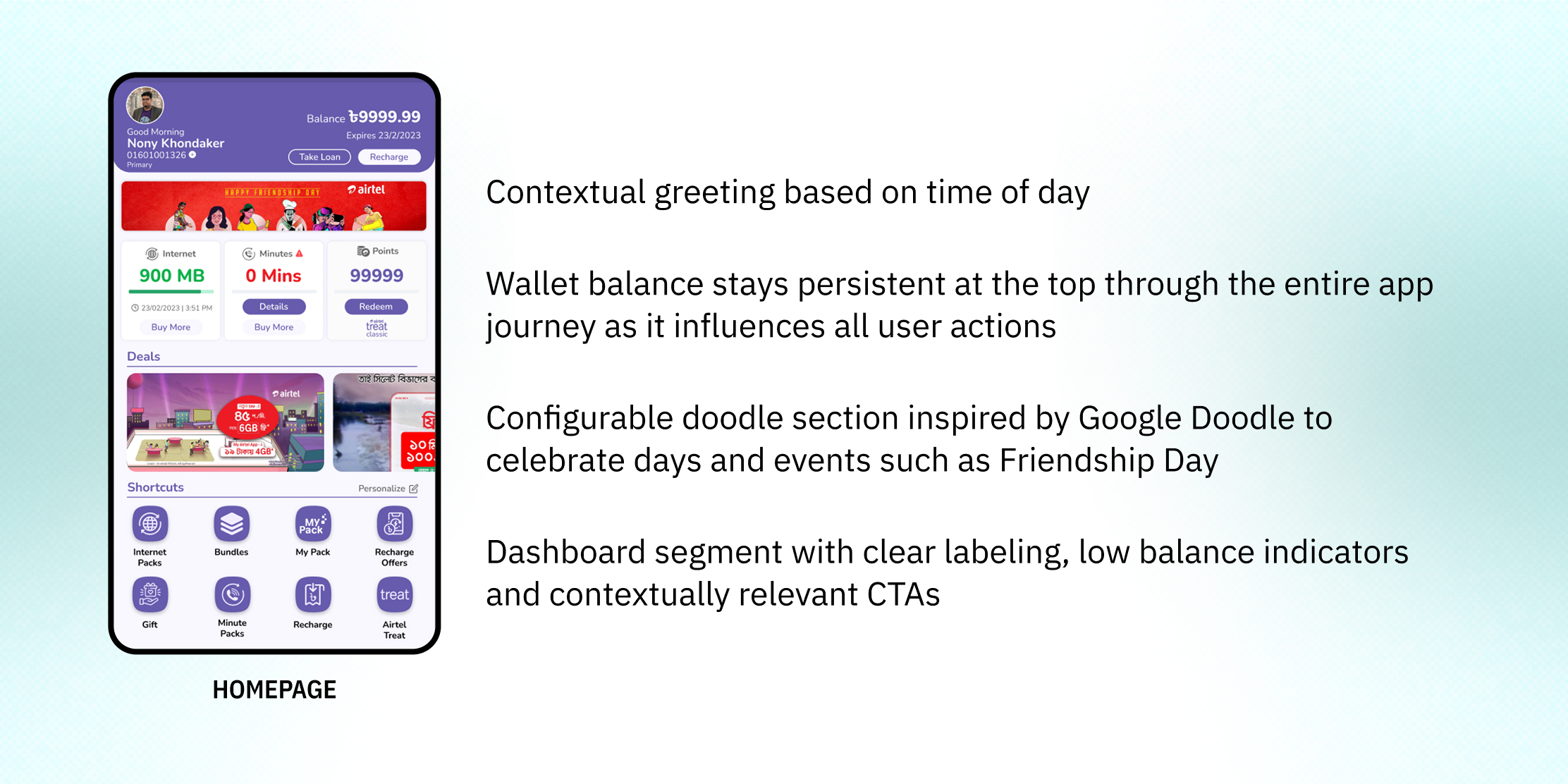
Solutions

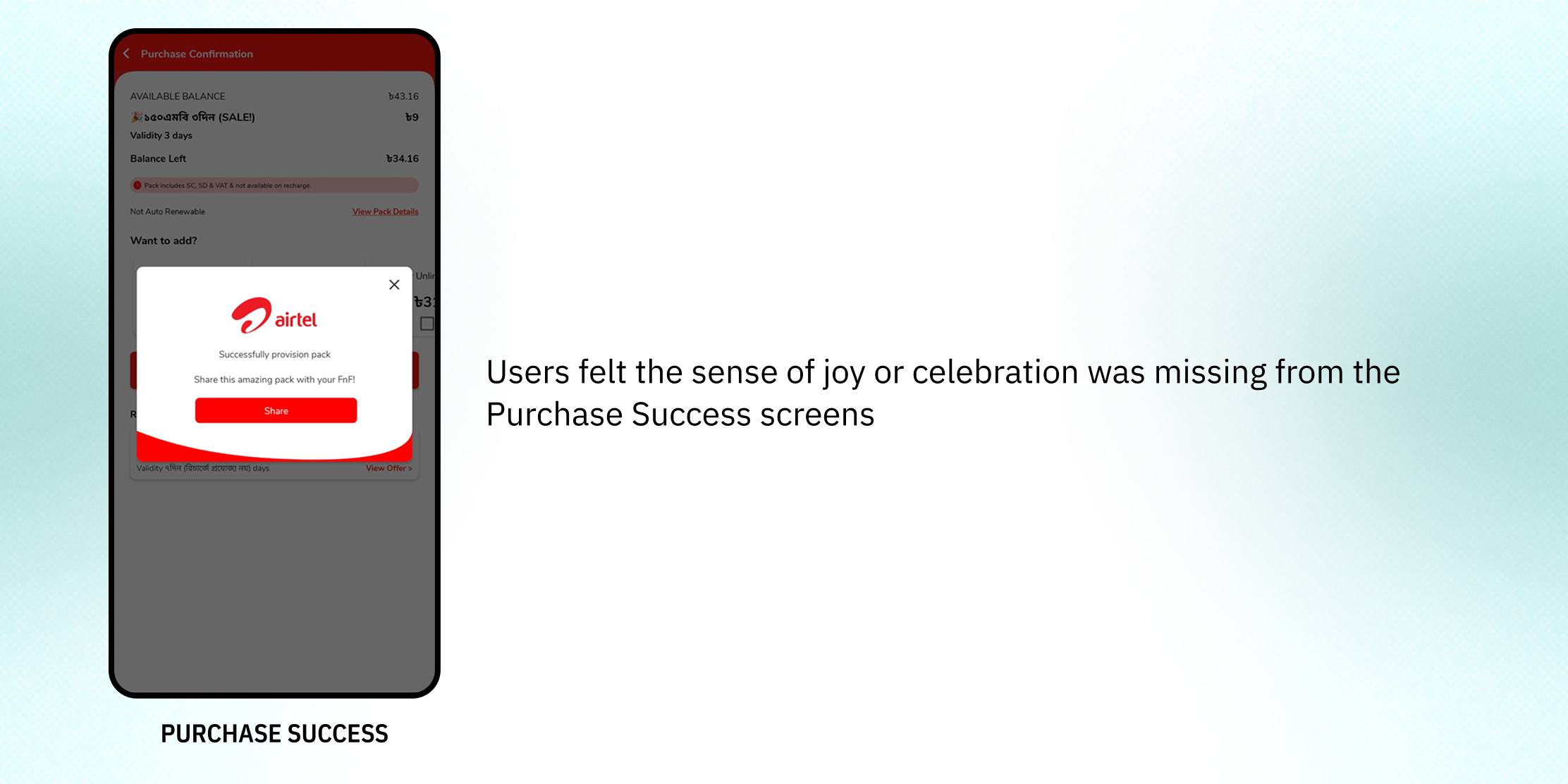
Evaluative Research
After preparing a High Fidelity Prototype, an evaluative field research was conducted in Dhaka, Chattogram and Sylhet cities with 14 real users

Accessibility Considerations
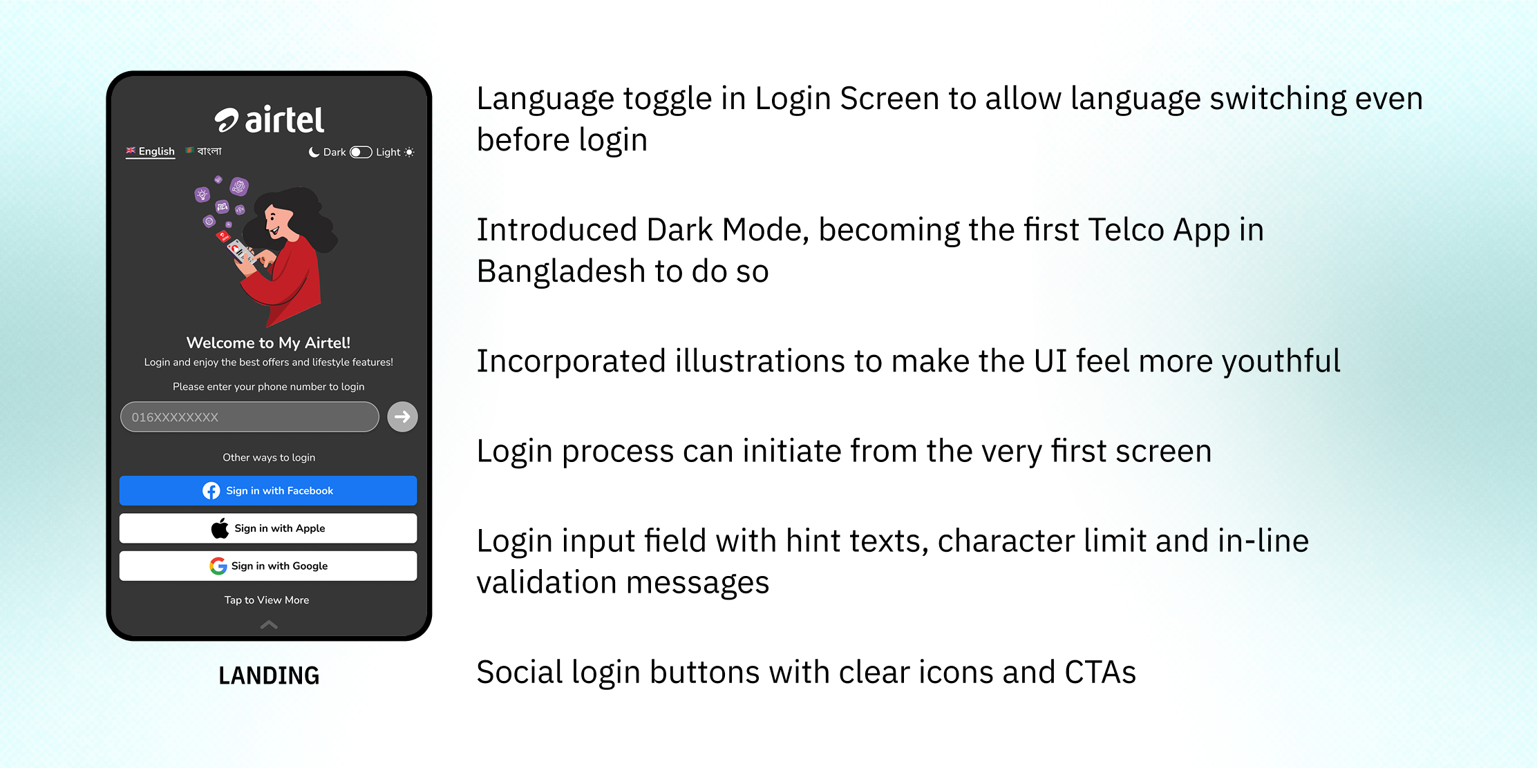
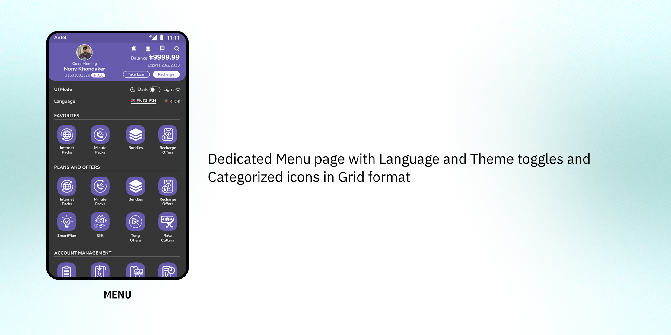
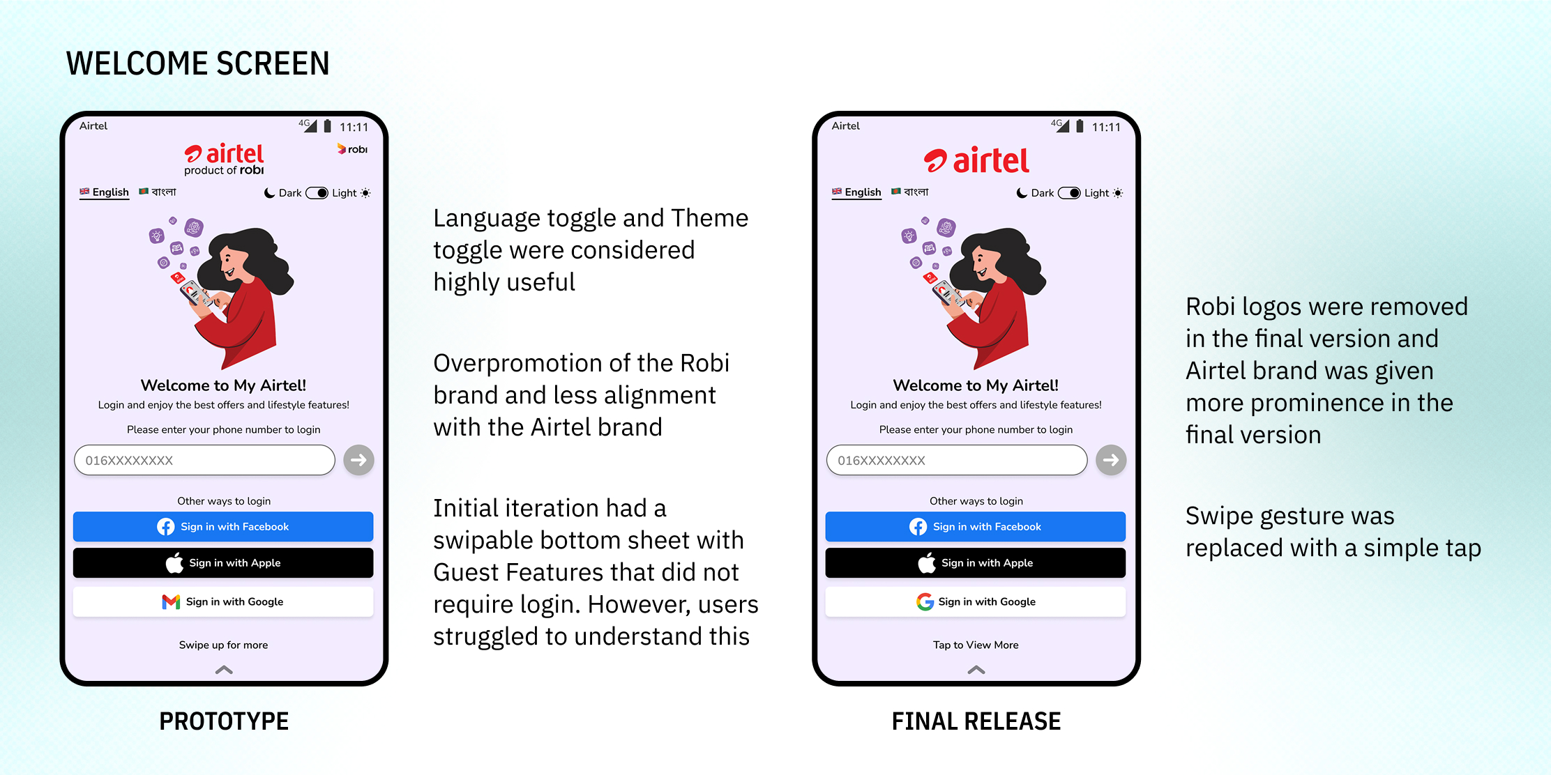
- Language switching allowed even before login
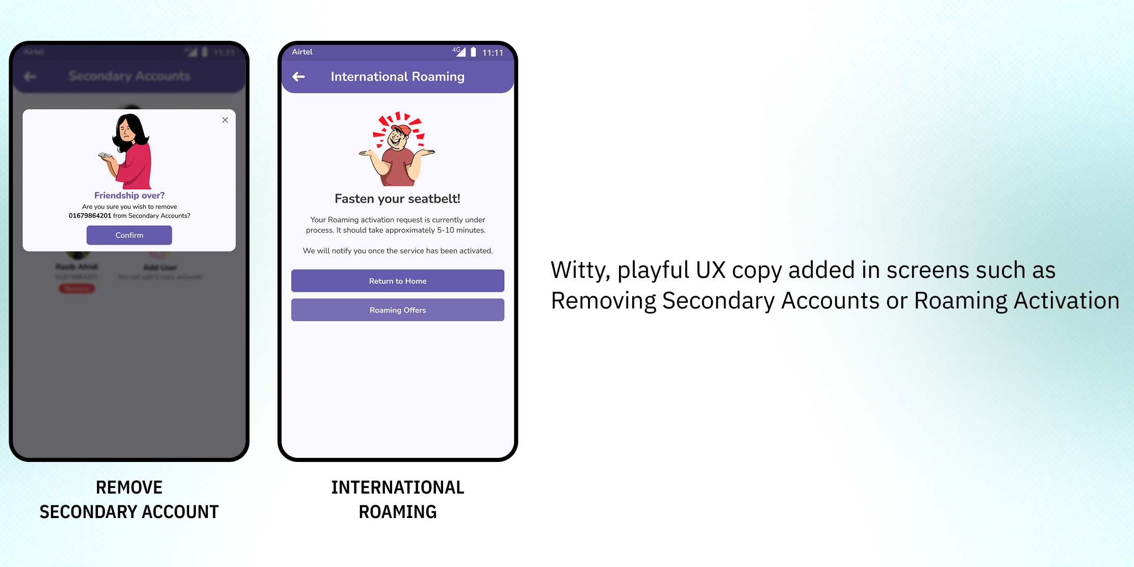
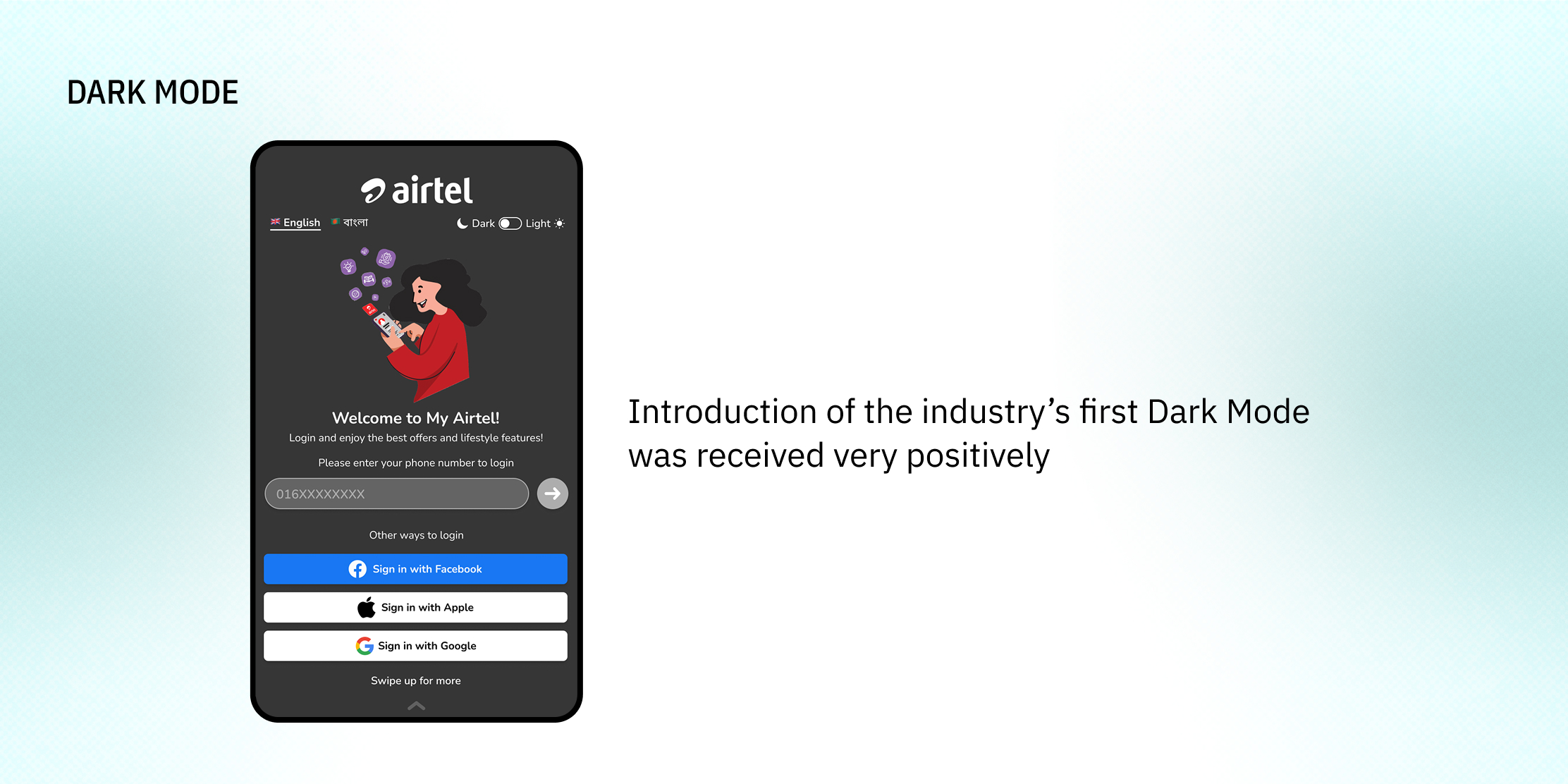
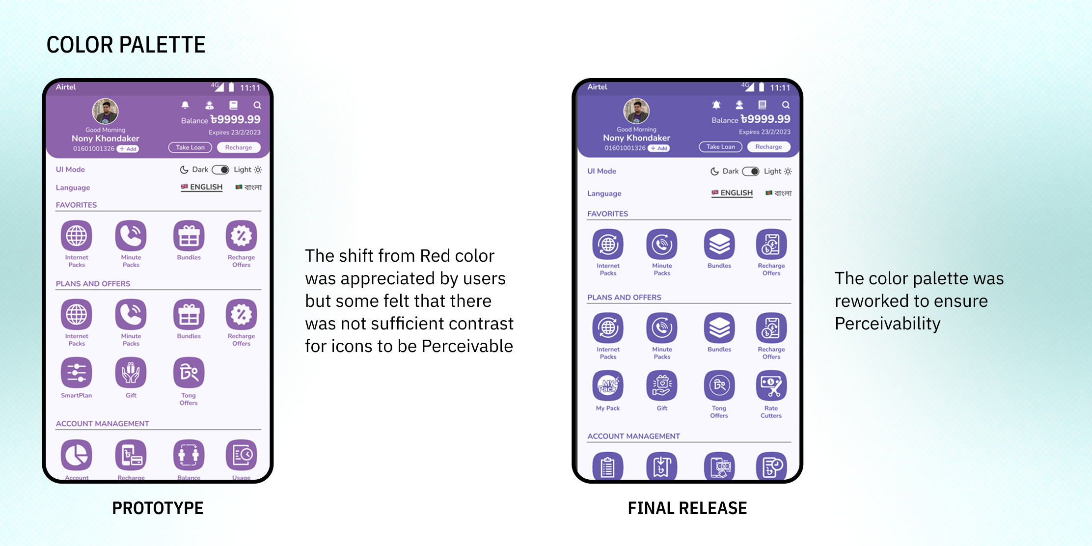
- Introduced Dark Mode and shifted away from bright red color for reduced eye strain
- Text buttons replaced with Rectangular buttons for better Perceivability
- Revised UX Copywriting to make the experiences Understandable
Developer Handoff

Outcomes
- 8+ MN Monthly Active Users (up from 5.5 MN)
- Improvement in Play Store Rating within one week
- Play Store Rating increased from 4.1 to 4.5
- Highest User Satisfaction in Bangladeshi Telco Industry
- 6x increase in Usage Session Times
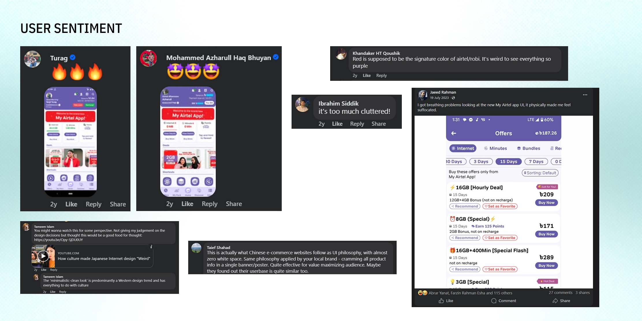
- Social Media Buzz regarding the redesign with users both praising and criticizing the design choices
Retrospective
What I learned
Unreliability of Research with Low Sample Size
In our evaluative research, respondents reacted positively to the bold design decisions such as the new primary color or reorganization of the balance dashboard. However, after commercial release, grievances regarding low brand affordance and too much clutter started to arise
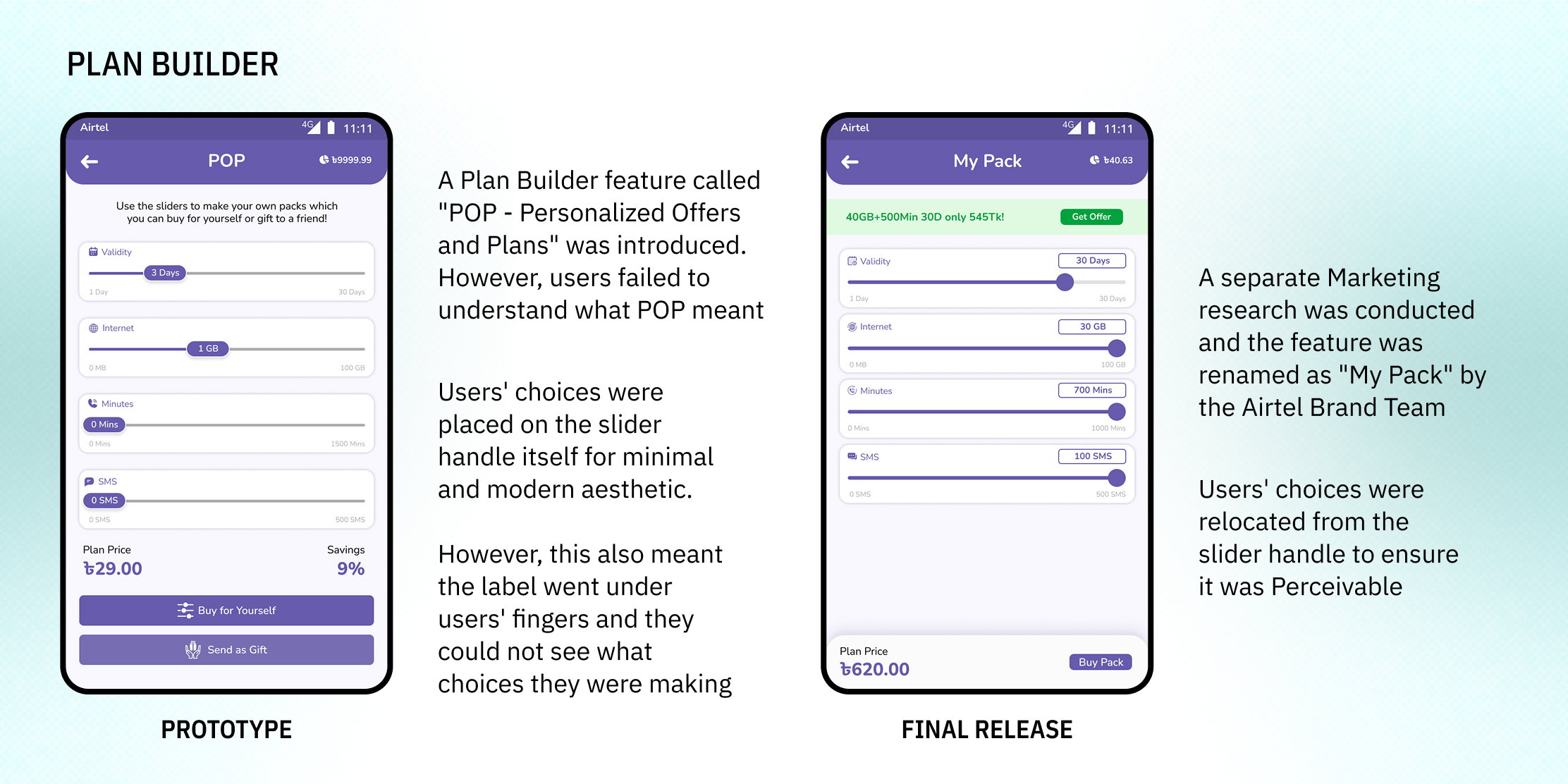
Opt for User-Friendly Terms over Brand Jargons
“POP” was a hip, trendy name for a personalized plan builder but users failed to grasp the concept of what it was. Renaming it to something as simple as My Pack yielded better results
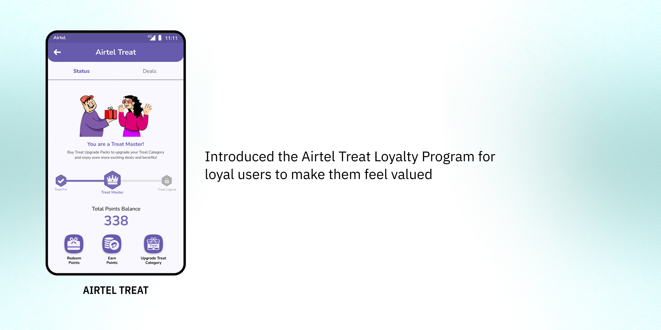
Understand your users
Addressing the young users’ unmet needs of a Dark Mode and feeling valued led to a dramatic improvement in Play Store and App Store Ratings
Account for Variations in Display Color Accuracy
Throughout this project, I struggled with ensuring a consistent aesthetic across device types. The primary color appeared more bluish in some displays while more pinkish in others. In fact, the office laptop I was using had an inaccurate display which contributed to these discrepancies. Later, we procured MacBooks to ensure accurate color outputs while designing.
Challenges/Trade-Offs
Accessibility vs Brand Affordance
Airtel is a globally renowned brand known for its bright red color. Dropping the red and white aesthetic for a more soothing and less stimulating color caused strong negative reactions among loyal users
Playfulness vs Minimalism
Incorporation of elements such as illustrations and witty copies to make the UI more vibrant and energetic often led to interfaces that were not minimal
Crunch and Scope Creep
It became an incredibly daunting task as the sole UX/UI Designer to deliver the revamped designs for such a complex app in less than 4 weeks
What would I do differently now?
- Negotiate regarding deadline or scope of work to prevent crunch or rushed delivery of designs
- Follow Accessibility Guidelines such as WCAG much more closely
- Reduce visual clutter and unnecessary UI elements such as dividers or irrelevant copies or icons
- Conduct UX Research with larger sample sizes and/or have a Beta phase before final release


4+ Years in PRODUCT DESIGN
HCIM STUDENT @ UMD